
In 2006, Stephen Seiler published an influential article in the Scandinavian Journal of Medicine and Science in Sports, titled “Quantifying training intensity distribution in elite endurance athletes: is there evidence for an ‘‘optimal’’ distribution?” In the article, Seiler concluded that elite athletes spend relatively little training time at the lactate threshold intensity. Instead, the athletes followed a polarized approach, with more than 75% of the effort at relatively low intensities, and significant (15-20%) periods at intensities well above the lactate threshold.
Since then, Seiler has been an advocate of polarized training, providing evidence that this training intensity distribution produces results, and more and more “recreational level” athletes are attempting to follow a polarized approach.
A new tool on Rowsandall.com now helps rowers assess their training intensity distribution.
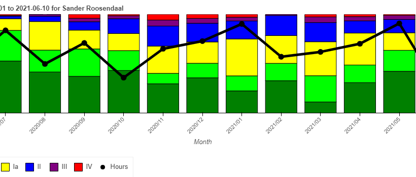
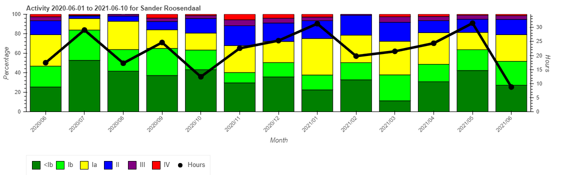
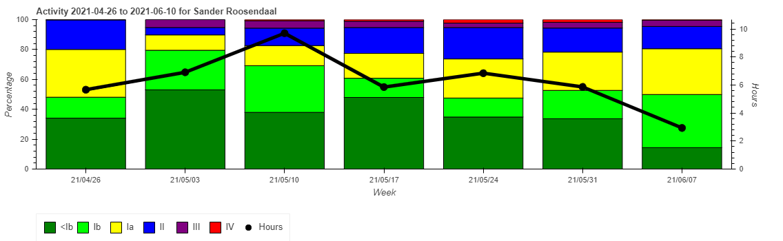 The tool produces a chart like the above, showing percentage of time in different heart rate or power zones that you can define yourself in the user settings. The above chart is one for myself. The green and yellow zones (Ia, Ib) are “well below threshold”. The blue zone is just below threshold, purple is just above threshold, and red is well above it.
The black line in the chart gives you the overal training volume (hours) per week.
On the site, you can easily change the chart parameters to
- Select a different time window
- Switching between weekly and monthly training periods
- Switching between heart rate based and power based values
- Switching between percentage of time and total time in zone
For example, here is a breakdown by month for the past year:
 And here is the same chart, with total time instead of percentage of time:
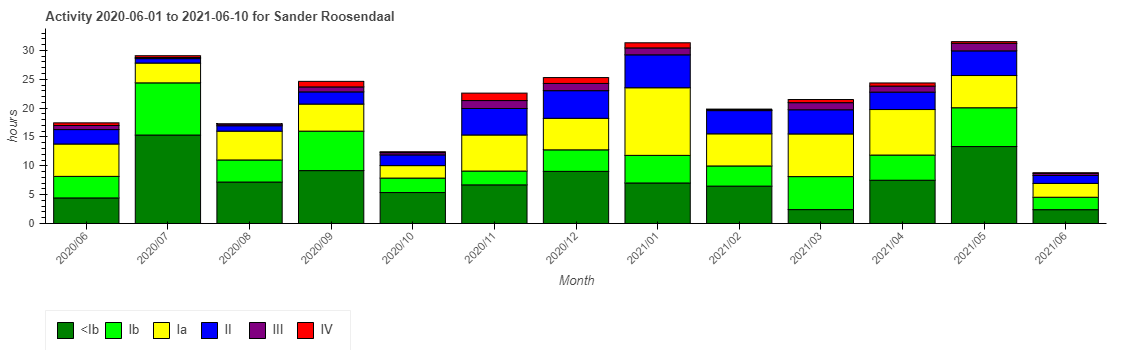
Same data, different representation.
In order to get the most use out of this new chart, first make sure that your heart rate and power zones are defined well in the user settings.
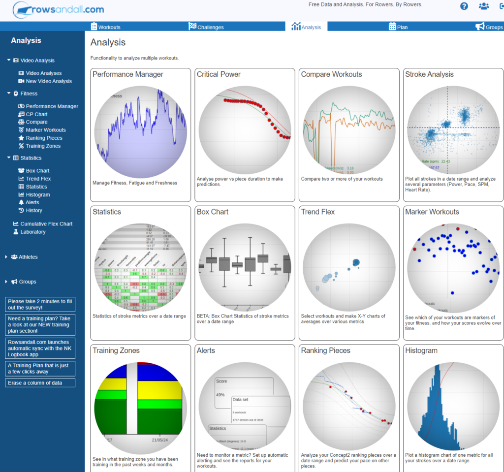
After that, you can find the new chart, called “Training Zones”, under Analysis / Training Zones”:
 Feedback on this new chart is welcome! Hopefully it will give you insight in how you are distributing your training intensity and use that to your advantage to train smarter and row faster!