Most world class rowers are tall. Some of them are extremely tall. And it makes sense, since work is force times distance. A tall athlete can pull the oar through a wider sweep angle, or on the erg, you can pull the handle a greater distance. So, for a given amount of force that an athlete can exert, the longer reach of the taller athlete should translate into more work, higher power and faster splits.
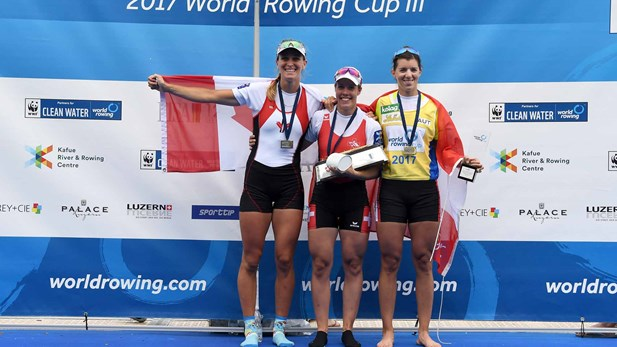
But how does that theory translate into the real world? In many cases, taller rowers have faster scores, but not always. Even in world class rowing, some of the best athletes are shorter than their peers…Switzerland’s Jeaninne Gmelin is a good example. She’s the winner in the middle of this picture.
I decided to harness the power of the internet to help me do a quick and completely NOT rigorous study. I put together an online survey and within 24 hours I had collected 238 responses. I had to manually process the data because there were numerous data integrity problems. These were typically times entered in incorrect formats, times entered as splits instead of total time, and english units instead of metric units for height and weight. There were a few weights that were ambiguous and I just took my best guess (see above reference to a lack of vigor).
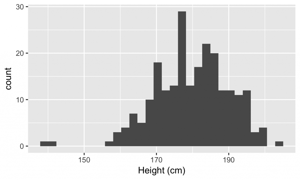
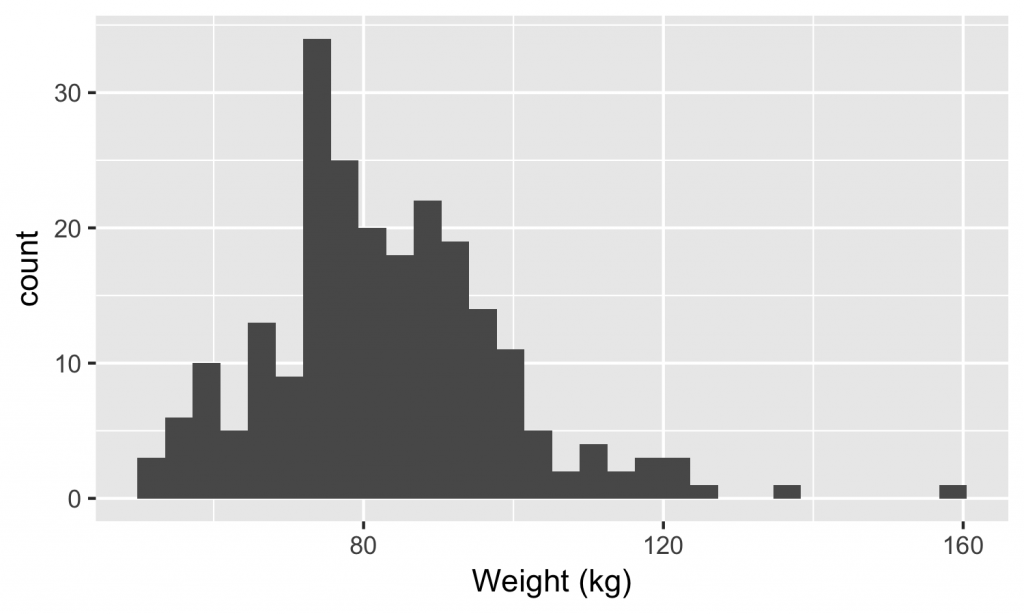
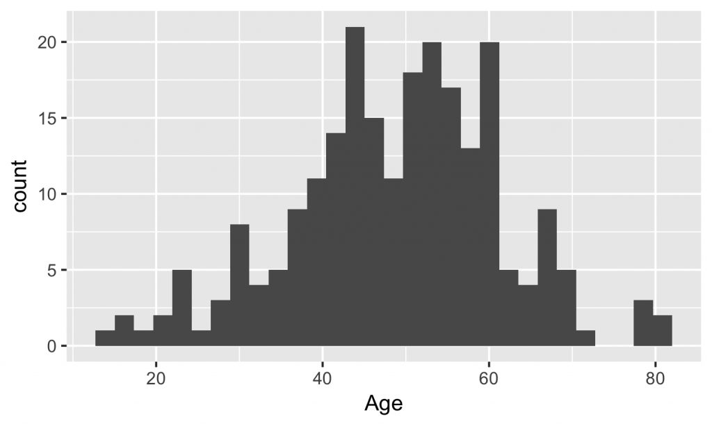
Here are a few descriptive statistics.
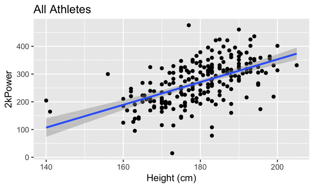
The heart of the analysis is to look at 2k performance versus height. To make things a bit easier, I converted the times to power. Converting it back isn’t hard, there is a nifty calculator on the C2 website
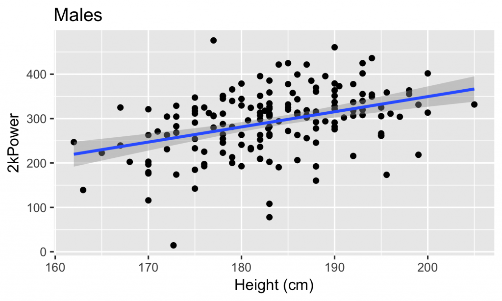
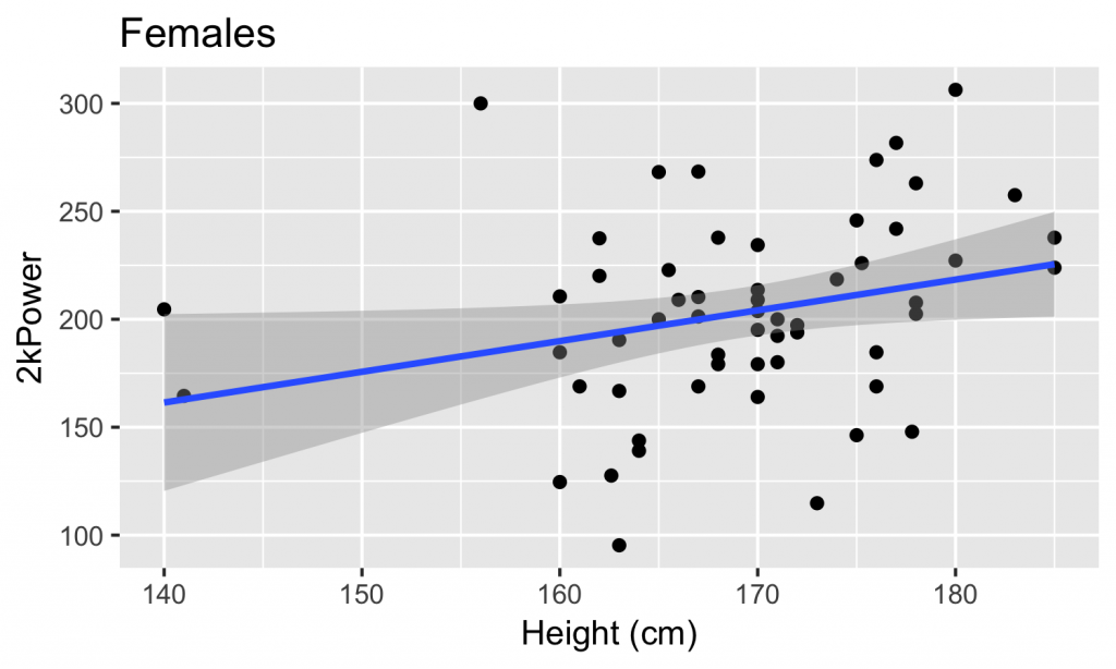
When I looked at the data graphically, two things seemed quite clear.
- There is definitely a relationship between height and 2k power. For men, this equates to 3.33W/cm of height gain, or about 1%. For Women, it is 1.25W/cm, or 0.6%.
- The spread of the power data at each height is much greater than the height based trend.
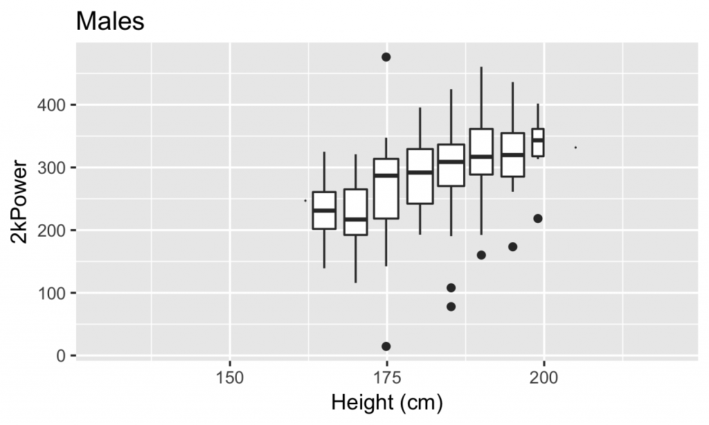
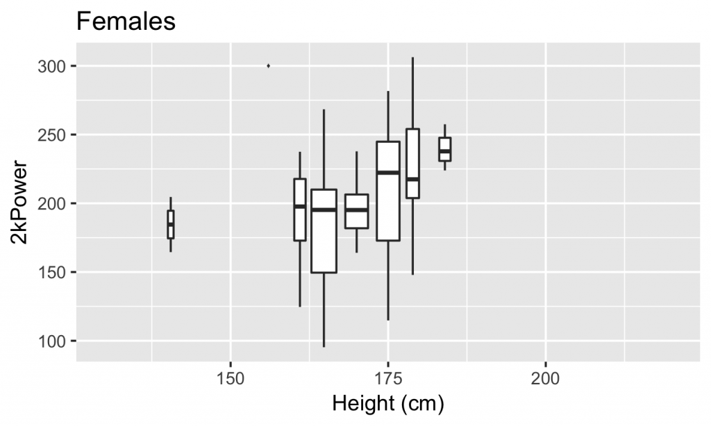
Here is an alternative way to look at the data. Boxplots show the mean in each slice of 5cm in height, The box depicts the range from the 25th percentile to the 75th percentile of the data, the whiskers depict the full range of the data and the dots represent outliers. What’s an outlier? That’s a data point above 99.3th percentile or below the 0.3th percentile. In this case, it is 2k powers that are remarkably different from the rest of the data (Ahem…Sam Blythe…Ahem).
This shows a couple things. There is a pretty neat trend for the men, but the variation in power within each 5cm grouping is still way larger than the overall trend. And from the plot for women rowers, it looks like I could use some more data before drawing conclusions.
What did I get out of this.
- If I’m racing someone taller than me, I’m gonna ask them to give me a second an inch as a handicap per 500m. That is the rough translation of 3.3w per cm.
- If I’m racing someone shorter than me, I’m gonna tell him that it’s really all about individual performance 😉

