
This is the third part of a series of articles on Rowsandall.com and the Empower Oarlock. The first article covered intervals, flex charts and force curves, the second part covered tools to compare and extract useful data from multiple workouts. This third article covers one topic: The Critical Power Curve.
Critical Power – what is it?
The concept of Critical Power is … powerful, and it is about exhaustion. Critical Power answer the following questions:
- How long can I hold a certain power until exhaustion?
- What is a smart power to hold for my next 2k/6k/4 minutes/20 minutes test?
In cycling, where power meters are much more common than in on-the-water rowing, Critical Power (or CP) is a popular concept. With the NK Empower Oarlock being the first commercially available, affordable way to measure power on the water, it is logical to start reaping the benefits of CP in our sport.
As the introduction suggests, Critical Power is the best average power (measured in watt) you can produce on the water in a given time frame. A Critical Power for four minutes (denoted as CP4) of 300 Watt means that you can row for four minutes with 300 Watt, before you are exhausted. Other common critical power values are those for 20 (CP20) and 60 (CP60) minutes on the longer end and 1 minute (CP1) on the shorter end.
The beauty of using Power (and not pace) and time (and not distance) is that you rule out any influence of wind, water temperature, and stream. That means that a CP chart holds irrespective of headwind or tailwind, water depth, and other disturbing factors.
A Critical Power chart shows the development of Critical Power values, from a single second to multiple hours, if you rowed that long. This chart is ideal to evaluate your personal performance and your strenghts and weaknesses. If you are a sprinter, you will have higher CP values below the five minute mark. If you’re a head race specialist, you will have the advantage between CP20 and CP60.
The CP chart is a great base for race preparation. Let’s assume you are preparing for a head race over 6k, which takes you about 24 minutes to complete. If you know your CP24, you can train and race close to that point.
The chart above is a CP chart produced by Rowsandall.com (the only rowing dedicated data platform that offers CP charts), and it shows that CP24 lies somewhere around a power of 200W for this rower.
How to generate data for a CP chart
CP charts are based on measured data: Your own workouts and tests. There are basically two ways to go about this:
- Add regular testing to your preparation program. That means a battery of tests across different time scales (1 minute, 2k, 20 minutes or 6k, for example) every 6 to 8 weeks.
- Build “signature” workouts into your regular training program. With “signature” workouts I mean workouts that make you work close to your Critical Power for a certain duration of time.
Of course, you can use a combination of the two. With those data collected, the difficulty is to filter out the “hardest” 1 minute effort, the hardest 4 minute effort, and so on for 20, 40, and other durations. Doing this in excel is tedious, time consuming and error prone. Rowsandall.com can do that hard work for you, automatically, every time you upload a rowing workout to the site. And as long as you use a Power meter on the water, record your workouts and get the data on Rowsandall.com, you can use either of the earlier mentioned methods. CP charts in Rowsandall.com can be based on all your data (for a user selected time interval of 6 weeks, 13 weeks, 26 weeks, or 52 weeks) or based on selected workouts.
How to obtain a CP chart on Rowsandall.com
There are two ways to get to a CP chart. The first way is through an individual workout, using the CP chart item in the menu, as shown:
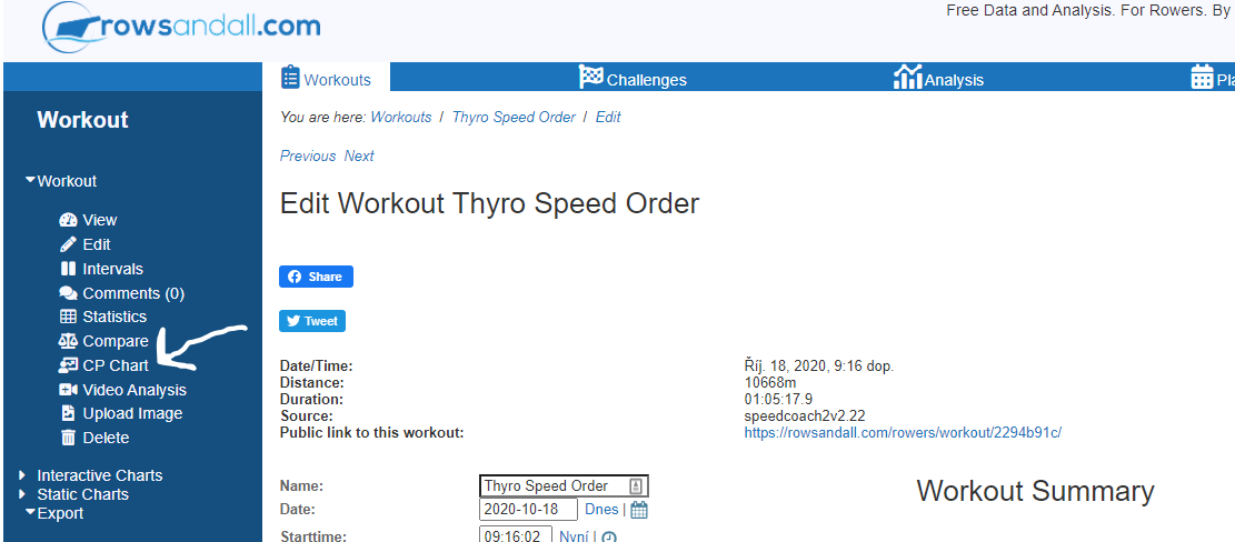 The second way is using the Analysis menu, then go to Critical Power. In both cases, you get to a page where you can select one or more workouts. (If you came from one of your workouts, that one is pre-selected.)
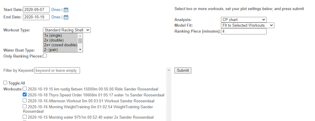
On the left, you get selection options to manipulate the list of workouts that you put into the chart. You can change the date range, workout type, or use a keyword filter.
Then, you select one or more workouts.
The options form on the right hand side allows you to quickly switch to other analysis types (with the same set of workouts). Also, there are two CP chart specific options, which I will explain later. Here’s the chart that was generated after clicking on Submit:
Note that the x axis of the chart is on a logarithmic scale. Don’t let that scare you. It’s just a handy way to present both the very short durations and the very long durations in one chart. There is a huge difference in the power that you can hold for 1 minute vs 4 minutes, but the difference between 40 minutes and 43 minutes is not very significant. So, the logarithmic axis expands the scale for shorter durations.
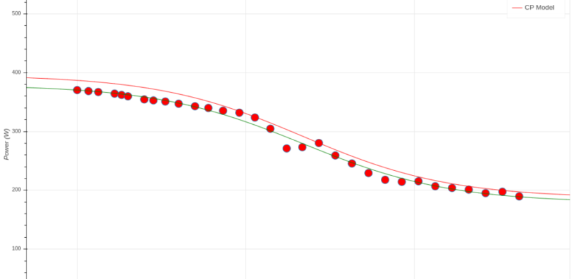
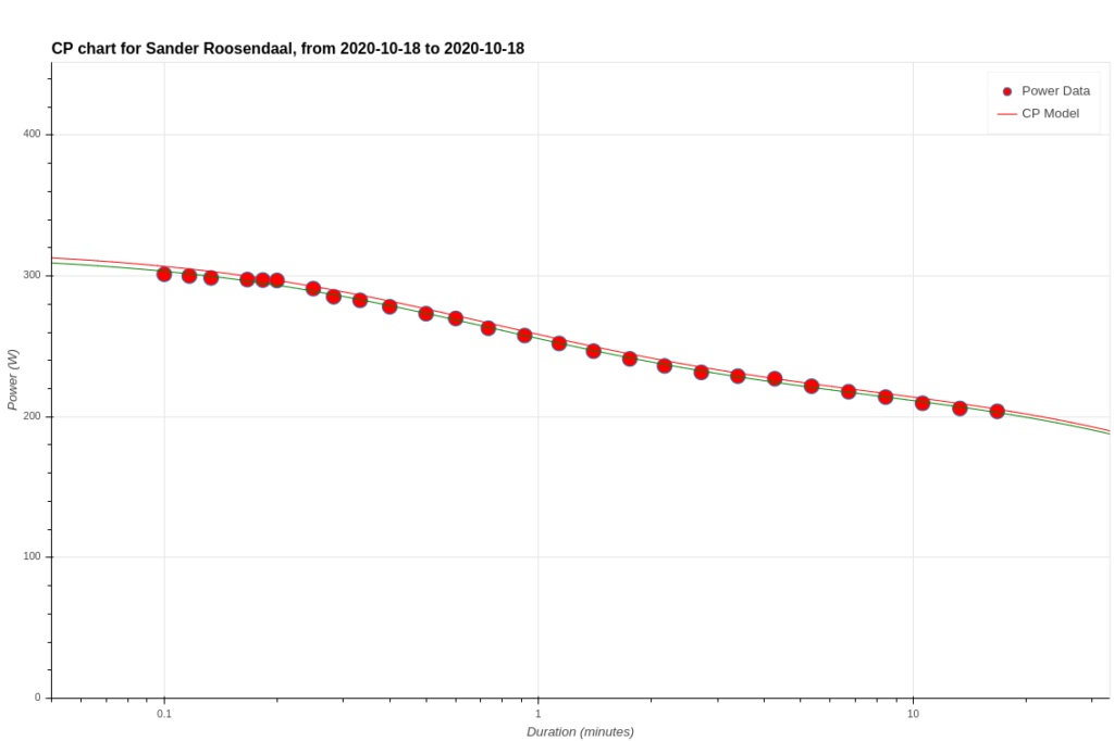
This chart above was based on a single session containing one hard piece of 3800 meters. I can add an extra workout with some short sprinty intervals and get this chart:
The red dots are your data points. In this chart, I have data from two workouts. For each time duration, only the hardest effort is selected, such that the CP chart represents the hardest you have demonstrated you can pull for that duration, across the selected workouts. By hovering your mouse over one of the red data points, you can see the original workout that created that point.
The red and green lines are fits to the data. The green line is a best fit through all data points. This gives a good indication of what you’ve done. The red line is shifted a bit to what the algorithm behind Rowsandall.com estimates your best effort should be, based on the data from these workouts.
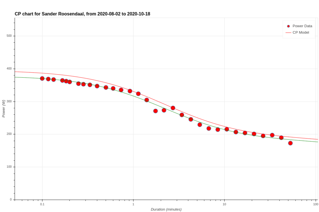
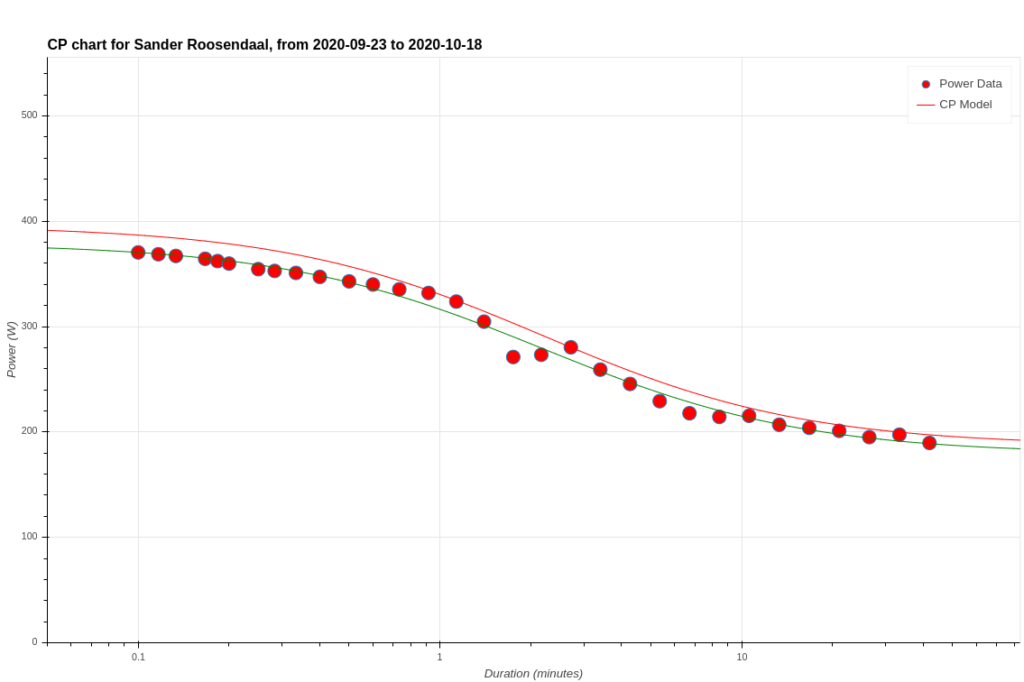
By changing the “model Fit” option in the form to “Critical Power Rolling Data”, I get this chart (selecting only the 4k hard effort workout):
Now, the red and green lines are a fit using all workouts of the last 6 weeks. The site starts building these data as of your first workout, and keeps a rolling maximum over a time period that can be set to 6, 13, 26 or 52 weeks in the user settings. That allows me to compare this single workout with my overall performance over the past 6 weeks.
As you can see, the hard 4k was close to my critical power for efforts longer than 10 minutes. In fact, if I would have paced this workout ideally, the red dots on the chart would be on a perfectly horizontal line around my CP16. Unfortunately for me, and nice for educational purposes, I didn’t do that. I can see that there was a sequence of 4 minutes where I was pushing at 40 Watt more than I could reasonable hold.
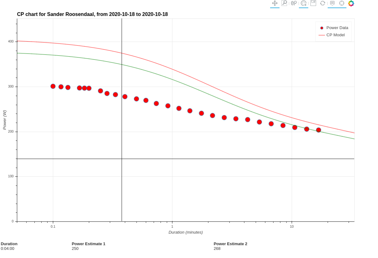
Also notice that below the chart, there is a predicted power for 4 minutes. Rowsandall.com added this prediction to make it easier for you. Instead of reading the value from the chart, you just change the “Ranking Piece Duration” field in the form to the number of minutes that you estimate your next race will take, and get the answer. The two values give you an upper and lower bound of the confidence interval of our prediction. The data are taken from the red and green lines in the chart.
If you use Rowsandall.com in combination with the Empower Oarlock, I encourage you to play around a bit with the CP charts and your various workouts. It’s interesting to look at those data. You can see in which workout you were really pushing it. You can think about the optimal pace for your next race. The best thing is, you can look at these data with the minimum number of those dreaded tests. Work less hard, get more results.
Conclusion
This is the third, final, article on using the Empower Oarlock in combination with Rowsandall.com.
More so than many other endurance sports, improvement in technique can significantly improve performance in rowing. The EmPower oarlock provides a robust, accurate way to measure important characteristics of the rowing stroke. This allows specific training objectives to be set and progress towards those objectives measured. But EmPower creates an avalanche of data, more than 25 parameters per stroke multiplied by hundreds or thousands of strokes per workout and hundreds of workouts per season. Rowsandall provides the ideal companion to EmPower to unlock the potential of all that data. The graphical and statistical tools on Rowsandall give a rower the ability to use all of that data to answer important questions.
- What do I need to improve?
- Am I improving my technique?
- Are those improvements leading to great boat speed?
- What is my optimal rate and pressure for best race results?
There is far more that the combination of EmPower and Rowsandall can do. Keep your eyes out for follow up articles on the topic.