Workflow, the new feature released by Rowsandall.com today, helps both novice and expert users analyze their rowing more easily and quickly.
Once you have started working with rowing data, you quickly find that you are doing a similar set of steps to visualize the data and understand if your workout achieved your objectives. Workflow allows you to store those steps on Rowsandall.com. Its default settings guide novices through the various aspects of their workout in an intuitive way. Its configurability allows experts to use the personal workflow they find most effective.
With Workflow, you have all the things that matter to you in one place. You can move functionality of rowsandall.com that you don’t use out of the way. You can set Workflow as your landing page.
What does it look like?
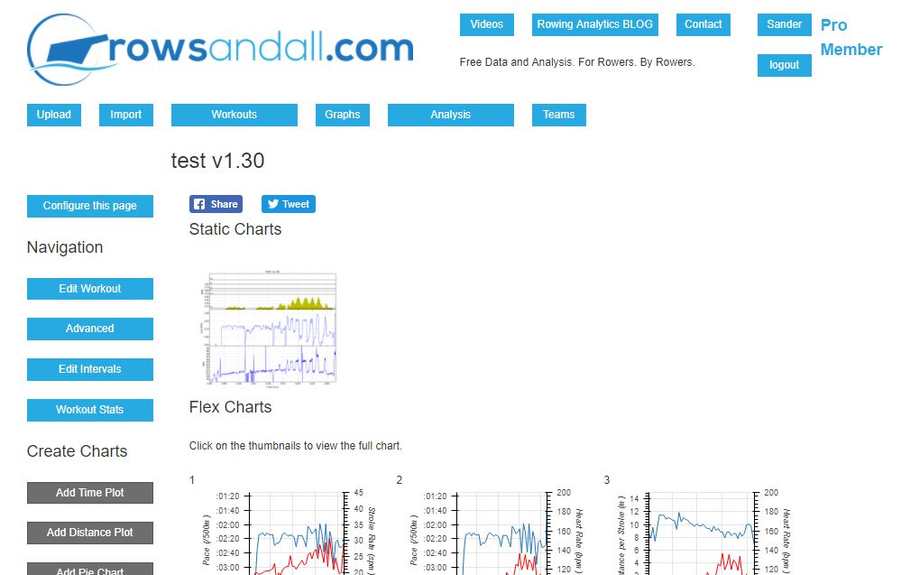
The chart above shows the default Workflow page, i.e. before you configure it to your own needs (see the section on configuration below).
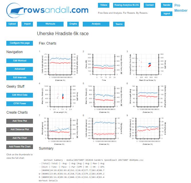
Here’s a detailed view of part of the page (for a different workout):

So, from left to right, top to bottom, you will see (apart from the usual rowsandall top menu):
* A side bar with a lot of buttons, starting with the “Configure This Page” button (read about configuration below). These buttons are the ones you will use most often, and the default values are “Edit Workout”, “Advanced Edit”, “Edit Intervals”, “Workout Stats”. Then there is a section with gray buttons allowing you to create new static charts
* Our new Facebook and Twitter share buttons, allowing you to share the Workout to your friends or followers with one click.
* The static charts that you have generated. Our static charts are really great for evaluating the workout at one glance. Also, these are the charts that show up in your shared workout Twitter and Facebook links.
* A whole bunch of thumbnail charts. These are our interactive Flexible Charts, and each one of the thumbnails is a link to a full size version. More about this below. The default set uses the basic rowing parameters that all apps and devices captures, and you can configure it to your needs.
* The workout summary. A bunch of numbers for you to review. Especially useful if you have defined intervals (or your app did that for you) and you can see the variation between intervals.
* For outdoor rowing, a map of your track.
The power of Flex Charts
The flex charts are really useful to dive into the data you collected during your workout. The nice thing of the thumbnails is that you can get an overview of what the most important metrics were doing for your workout. Hover over the thumbnail with your mouse, and you get a short description of what the chart should tell you. If you want to see more: Click!
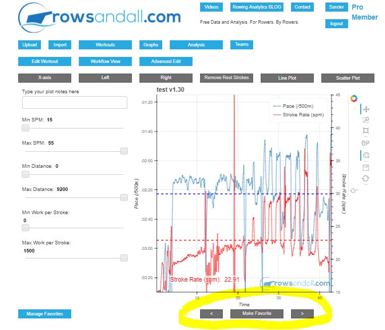
That click brings you to the flex chart page, shown above. This page allows you to chart any metric against any other metric. You can use the sliders on the left to limit the selection, and with the gray buttons on top you can change the metrics on the X, Y and alternative Y axis.
However, I want to point your attention to the three highlighted buttons at the bottom. The big one reads “Make Favorite”, which adds the particular combination of metrics you are charting here to a list of “favorite” charts. It is exactly that list of Favorites that you were seeing, in thumbnail form, on the Workflow page.
The small buttons allow you to browse through your set of favorite flex charts without having to go back to the Workflow page. This enables you to very easily review your favorite set of flex charts for each workout.
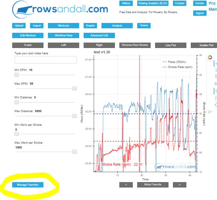
So in summary, the popular Flex Chart has been tweaked to allow you to use the same set of flex charts for each workout, without having to remember the set or having to manually select the metrics you want.
To allow you to tweak the favorites that you have saved, there is a “Manage Favorites” button, highlighted in the picture above. More about that in the Configuration Setting below.
How do I get there?
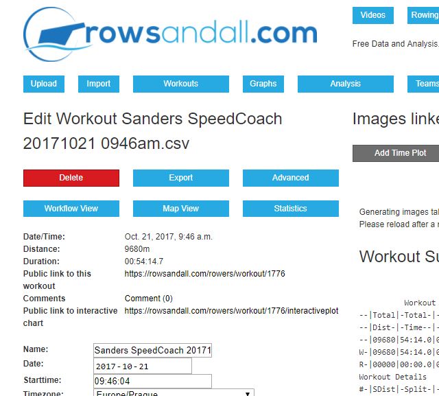
The picture above shows our updated Workout Edit Page. See the six buttons, one of which is the red Delete button? There used to be five buttons there. I’ve added “Workflow”. I have done this for all Workout related pages on the site. So you can get back to Workflow with one click from almost anywhere on the site.
How do I configure Workflow?
Adding and removing items from the Workflow page
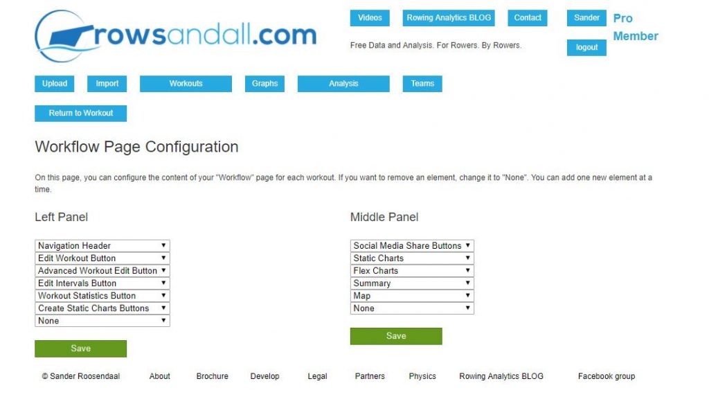
When you click on the “Configure this page” button on the Workflow page, you get to a page that looks like the one above. It is super simple. You can select all the available buttons for the left panel and all the available elements for the middle panel of the Workflow page.
Want to remove one of the buttons? Just set it to None, then press “Save”.
Want to add more buttons? You can add them one by one by using the last field, which is default set to “None” by default. Change it to the element you need. Then press Save. The form will always have one more fields than you have currently defined buttons, so that will allow you to define as many buttons as you need (and as you are prepared to scroll). You can of course also use this to change the order of the buttons. Some of the elements you can select on the left panel are just section headers, to allow you to group the side panel in groups. And while we’re at it: Nothing prevents you from including the same button more than once. You have full freedom here.
The middle panel works in exactly the same way.
So – are you missing your favorite part of the site or a button that you need? Let us know (comments section below this blog) and we’ll consider it!
Managing your favorite set of Flex Charts
Clicking on the “Manage Favorites” button on the Flex Chart page brings you to the following page:
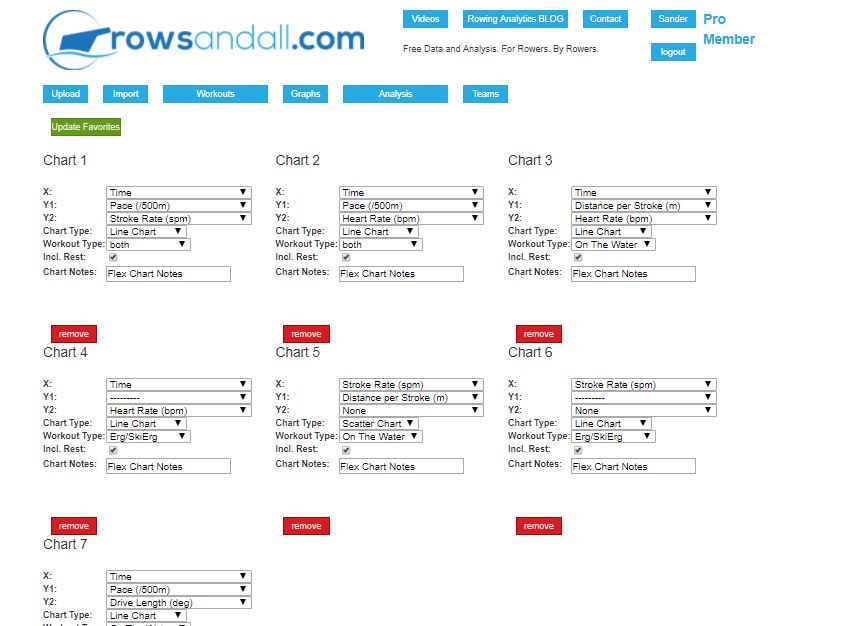
On this page, you can change the metrics displayed on the axis, set some other details for the chart, and you can remove or add charts.
The one thing to remember is that to make the changes on this page permanent, you have to press the green “Update Favorites” button near the top.
Here’s a close-up to the form to edit one of your Favorites:
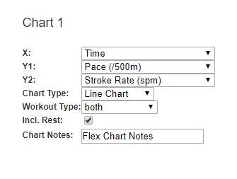
So what is on this form?
* X axis – choose the metric you want to have along the X axis
* Y1 axis – the metric on the left Y axis
* Y2 axis – the metric on the right Y axis. None is also an option.
* Chart Type – choose between Line and Scatter
* Workout Type – choose between water, erg, or both 1
* Include rest strokes. Ticking this box includes the paddle strokes during the rest periods. Leave the check box empty, and you will only see the “work” intervals.
Setting Workflow as your default Landing Page
Do you like the Workflow page so much that you want it to be the first page you visit after uploading a file or clicking on a workout in your workouts list?
You can do that in Settings. Settings are accessed by clicking on the blue button with your name on it (top right on every page on the site). Under the header “Account Information” (which I probably should rename to Account Settings), you can switch this from the default “Edit View” to “Workflow View”. That sets the default choice. Now, when you upload a file, you may want to deviate from the default behavior. That is why we have a new option in the upload options on the upload page. It is called “Landing Page” and I believe its use is straightforward.
- In the near future we will make the selection wider, possibly by workout source (CrewNerd, SpeedCoach, ErgData, etc) because it is often the source determining which metrics you have available ↩
