Contents
Introduction
If you participate in any internet forums about indoor rowing, you will often see posts asking about advice about how to pace an unfamiliar distance or time.

You will also see a lot of people looking to find out how good (or bad) they are compared to others

The people that post these questions discover a couple of things pretty quickly.
- There are a lot of people that want to share helpful opinions
- That the opinions don’t often agree with each other
Ultimately, through a lot of back and forth discussion about times over other distances, the age, weight and gender of the rower and training status a consensus emerges to answer the question.
These and other questions really boil down to:
- How good is my score compared to the World’s best (for my age/gender/weight group)
- How good is my score compared to the average rowing population (again for my age/gender/weight group)
- Where are my weak spots? Should I improve my scores on the shorter distances or focus on the longer ones?
The great thing about Indoor Rowing is that it produces numbers. Lots of numbers. And even better, the numbers are comparable world-wide (at least among the most widely used brand Concept2) and Concept2 has done a good job of collecting self-reported (and many verified) erg scores.
We can use those data and try to answer the questions above in a way that is supported by evidence and the concepts of sports physiology.
World Records
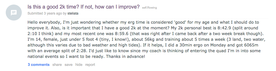
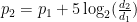
Let’s jump straight to the world records. Concept2 maintains a list of official, verified Concept2 ergometer world records for all ranking pieces 1. For example, the 2k records for all ages, genders and weight categories are on this page. The ultimate comparison of your performance is against the world’s best time for your age, gender and weight group.
 As the picture shows, in general, the fastest scores are achieved in the 20-29 year age category, but there are exceptions. Rob Waddell’s world record in the 30-39 age category, of 5:36.6 (2008) is faster than is own record in the 20-29 age category.
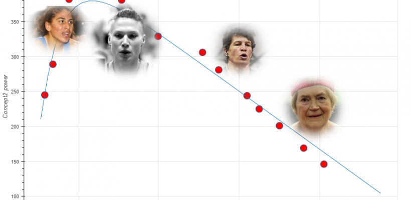
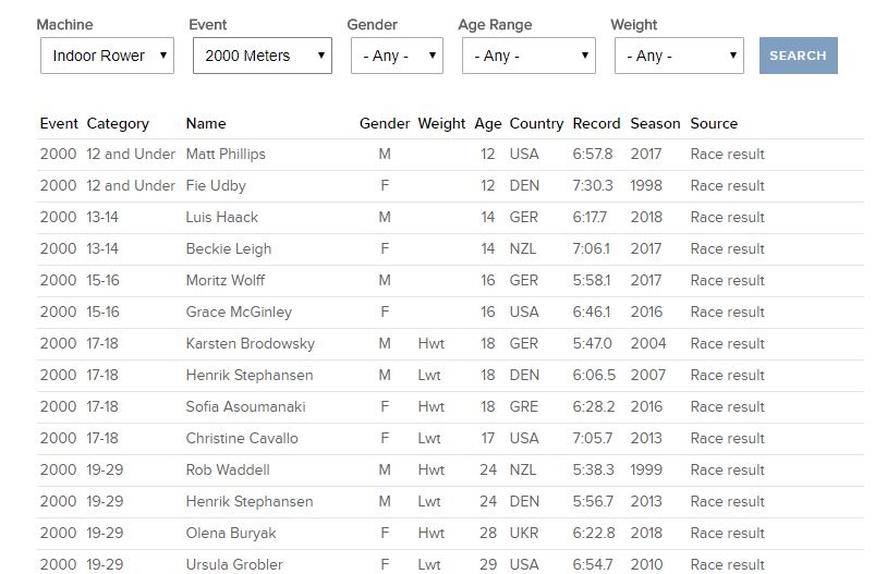
This also shows a risk of comparing your score against the world’s best time. You may be in the same age group as a freakishly fast rower, and thus you will always be worse off. Conversely, if your cohort is weaker, you might seem much better. Therefore, it is better to take into account the trend across all age groups for a certain ranking piece. For example, the 10k for heavyweight men:
The red dots in this chart are the 10k World Records, based on this list. We are using power instead of pace
When two competitive rowers meet, the question that is either openly discussed, or lurking in the back of their minds is…I wonder what his (or her) 2k is? And many training plans, coaches, clubs and people focus on how fast you can row a certain distance. This makes a lot of sense, since that is essentially what almost all rowing competitions are, both indoor and on the water.So, why are we talking about how much power you can produce over a period of time?Good question. There are a couple of reasons.First, focusing on how much power you can hold for a specific period more closely lines up with how the energy systems in your body actually work. There is one system that gives you a lot of power over a short period (~10 seconds), another that works over a bit longer period, and a third that provides the ability to produce a lower amount of power for a much longer time.Second, it allows a model to be used that works over a much more diverse group of rowers. Basically, a 2K erg test for a world class male athlete is going to be over in less than 6 minutes. If you are an 80 year old woman, it will take more than 50% longer, over 9 minutes. This means that it will rely much more heavily on aerobic fitness and less on anaerobic.So, all the models here are based on power and time, but they can be converted to pace pretty easily using online tools, like the one on the concept2 webpage
More important than the individual records is the blue line. Most of the records are close to the line, but Eric Murray’s record, set at the age of 32, as well as TJ Oesterling’s record set at the age of 65, are clearly above the mark, and for some reason, the records in the 40 to 60 year age interval seem to be on the weak side.
The blue line is a fit to the data, which helps to find the outliers and enables to focus on the general trend. It also shift the attention away from the exact world records to general “world class performance”.
We have generated these fits for all ranking distances, for men and women and for heavies and lightweights. In general, the performance indeed peaks between 20 to 30 years of age. I suspect that this is also the case for the 10k for LWT women. If only we could have some LWT women between 18 and 29 to set a record, because currently there are no records between 18 year old Brigid Kennedy and 29 year old Emily Schmieg, both from the USA and both records rowed in this indoor rowing season 2
Update December 2019: Brigid Kennedy has just set a new record as a 20 year old. She set a fantastic time of 39:10.4 in the 10K. Congratulations to Bridget, and we hope that she continues to set 10K records.
Here are graphs for different pieces and age categories, to flip through. Click on the image to see a bigger version:
Another way to view world record results is to look at the all ranking pieces, for a specific age, like this:
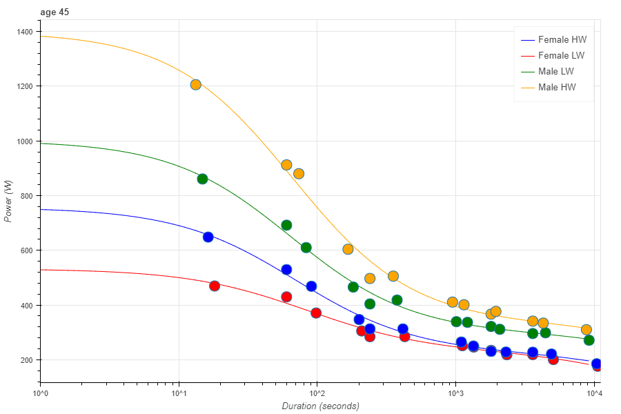
This chart is based on the position of the blue lines in the previous plots, sliced at 45 years. So this time the dots are not actual World Records, but “World Record trend performance” for a 45 year old, for all ranking distances and gender/weight categories.
Note that the horizontal (time) axis uses a logarithmic scale. This is just a handy way to get all the ranking distances on the chart. Otherwise, the Full Marathon would be on the far right, the Half Marathon in the middle, and all other ranking pieces crammed in the left 10% of the chart.
Also, I have drawn lines to guide the eye. I have to make an important remark here. The lines do not represent any performance of a single individual! There is no age/gender category where all ranking pieces are dominated by a single individual, although in the Women’s lightweight 50-59, Joan Van Blom (USA) 3 comes close.
In any endurance sport, some athletes are better at short events, and others are better at longer events. Rowing is no different. Lets call these two groups sprinters and stayers. Looking at these plots makes it easy to see the difference between stayers and sprinters for the different gender/weight categories. It’s a common belief that lightweights are better stayers. We can see if there is evidence to support that by simply normalizing the graph to the 1 minute performance.
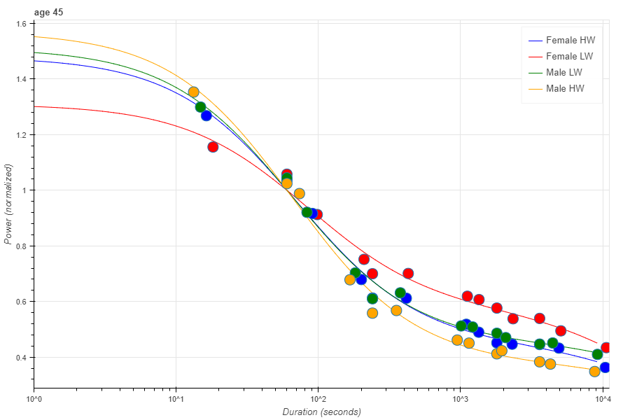
So in this chart, I have set the 1 minute performance to 1 for each weight/gender group, and all other performances are expressed as the power fraction of that. Indeed, lightweight female rowers are relatively better at long duration events than female Openweight rowers, and also for male rowers there is a difference (although it is less pronounced than for the women). The charts for 25, 45 and 65 years show that these characteristics don’t change much for the very best rowers of different age classes.
By fitting the Concept2 age group records to age trends, we have a method to estimate “World Record” performance on the erg for any age, gender, weight class and any ranking piece. On rowsandall.com we use the Concept2 world record data to provide a benchmark your performance. If you are close or above the line indicating world record, you should consider setting an official record. This way of measuring is also similar to the way New Zealand Rowing prepares for the next Olympics. They predict what the World Class standard is going to be (from historical trends of how the times improve) and work towards being on or above that level.
As long as Concept2 publishes World Records, we will regularly update our charts to the include the most recent records. For example, we already have the new 50-59 5k record set on January 9 by Andrew Benko in our database. Andrew broke a 16 year old record by 13 seconds and thus “corrected” a major negative outlier to our fitted curves. Thank you, Andrew!
Coming back to our “World Class Standard”, on version 2.0 of our Ranking Distance CP Chart, you will see this depicted as follows:
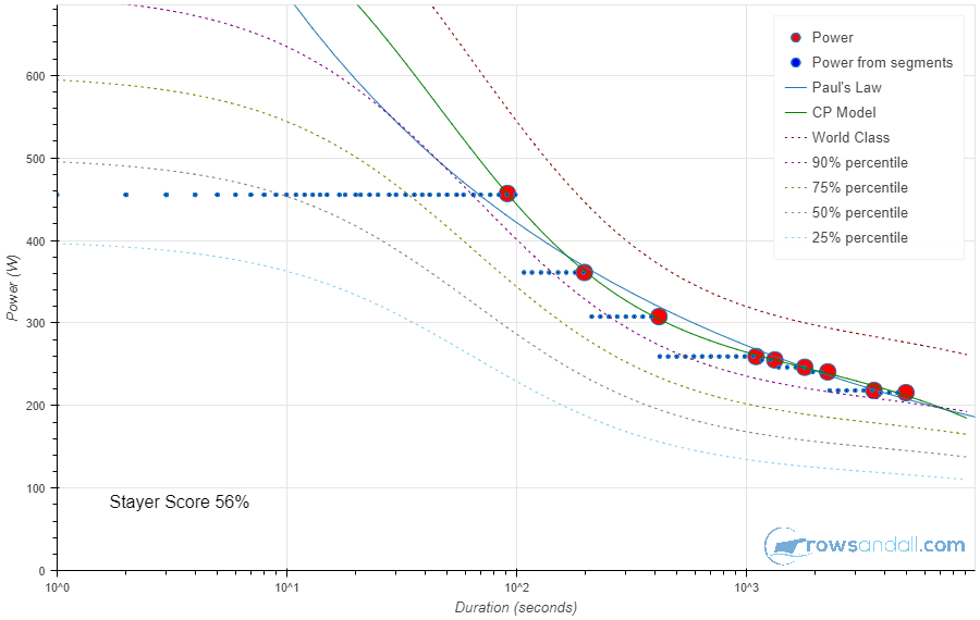
The dashed purple line, marked “World Class” marks the boundary of being a world class erg rower. I have set it to 95% of predicted World Record performance, because then being above this line means that you are at the top of the Concept2 rankings. The other dashed lines are derived from this, and are an indication of where you need to be to achieve a given percentile score on the Concept2 ranking 4.
There are also some other lines and dots on this chart. These will be discussed in other sections of this paper.
Individual Critical Performance Curves
In the previous section, we warned that the World Record performance per distance, for one age, gender and weight category should not be interpreted as the performance of a mythical individual “World Record Producing Rower”. For each category, it is likely that the record on the shorter distance was set by somebody who is better at sprinting, and the record at the longer distances was set by a typical stayer.

Here is a first attempt at defining a sprinter and a stayer in indoor rowing:
- A sprinter is an athlete who can produce a higher power over short pieces than the average athlete.
- Similarly, a stayer is an athlete who can sustain a higher power than the average athlete over long pieces.
These are not very good definitions. First, we would need to define “short” and “long” pieces. Also, what about rowers who are below average on all distances? Can they be sprinters or stayers as well?

They sure can! All we need is a definition that separates the absolute performance from the athlete’s relative one. We will do this by looking at erg scores over multiple pieces and looking at their relative power. A big drop from a sprint piece to a long distance piece is then typical for a sprinter, and a small drop indicates a good stayer. We’re going to greatly refine this model and base it on some solid statistics, though. A good starting point is the Danish Standard (although the Danes call it the Gold Standard). Using the 2k erg score (in watts) as the baseline, the Danish coach Kurt Jensen found that, for world class OTW rowers:
- 10 second all out average power wattage is 173% of the 2k average power.
- 60 seconds all out is 153% of the 2k average power.
- 6k power is 85% of 2k average power.
- 60 minute ‘hour of power’ average power wattage is 76% of 2k average.
It is a great idea to test rowers on multiple test distances in one week to assert the rower’s strengths and weaknesses and measure progress. (Click for a powerpoint presentation by Kurt Jensen explaining how he uses his test suit).
Jensens approach can be improved to be more in line with physiology and more applicable to all age groups, and not only to Olympic class rowers. It is questionable if the percentages above hold for other age groups and for athletes who are simply not world class, but mere enthusiastic amateurs. If you just want to be the fastest rower in your gym, you may draw the wrong conclusions.
Second, instead of using a mix of distance and time based test pieces, I would argue to only use time based pieces. For a 50 year old lightweight woman, the 2k is a much more Aerobic affair than for a 19 year old heavy man. It makes more sense to compare only time based results.
Of course, many people like distance based pieces more than time based ones, and the 2k will and should always be part of a test suit. Luckily can use scores from all ranking pieces to establish the Power-Time (to exhaustion) relationship for an athlete. A plot of this Power-Time relationship is called the Critical Power (CP) curve.
It turns out that there is an almost universal relation between the produced mechanical power and the duration to exhaustion. There are various mathematical models in the literature to describe the CP curve. See this interesting article by Charles Dauwe for a discussion of the CP curve for cycling.
The classical CP model is given by the following equation:

Where P is the power you can hold over a duration t, and CP and W are constants that can be used to fit this curve to your ranking piece power values.
For now, we will consider this equation a pure mathematical construct with no relation to real physiological energy systems.
It is very tempting to read more into the CP equation than a mathematical construct. Many have equated W with some amount of “Anaerobic Energy” stored in the body. An energy bank from which you can withdraw at an arbitrary rate, such that it is emptied at exactly the time you finish your piece. Similarly, CP then becomes the Anaerobic power that you can hold forever because you are not depleting your anaerobic energy stores.
However, when trying to link the equation above to physiological energy systems, we discover a few flaws. Let’s call them “CP violations”:
- There really is no (non-zero) power that you can hold forever. Well, you may be able to go on forever at 50W, but really the curve should go to 0 for infinite workout durations.
- The model fails to predict 10 second, 100m and one minute efforts, because for short durations the power goes to infinity.
- The body does not have one “Anaerobic” energy source
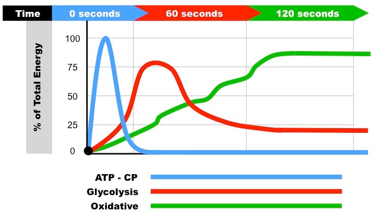
Starting with the third “violation”, let’s review the available energy sources. I will provide very brief summaries. If you want to learn more, Google is your friend:
- Phosphagen System – The only energy system which could be argued to have a fixed energy stored. This is an anaerobic system. However, the energy is depleted in the first 10 seconds of your exercise before the other energy systems start up, no matter how slow you go. You cannot decide to not use this energy system, although you may not entirely deplete it when you go slow.
- Glycolysis. During glycolysis, carbohydrate—in the form of either blood glucose (sugar) or muscle glycogen (the stored form of glucose)—is broken down through a series of chemical reactions to form pyruvate (glycogen is first broken down into glucose through a process called glycogenolysis). For every molecule of glucose broken down to pyruvate through glycolysis, two molecules of usable ATP are produced (Brooks et al. 2000). Thus, very little energy is produced through this pathway, but the trade-off is that you get the energy quickly. Quickly, but not as quick as the the phosphagen system. This energy system produces some “waste” by products, which, if it is not cleared out fast enough, cause a pH decrease in your muscle and reduce the ability/speed of the muscle to contract.
- The aerobic system—which includes the Krebs cycle (also called the citric acid cycle or TCA cycle) and the electron transport chain—uses blood glucose, glycogen and fat as fuels to resynthesize ATP in the mitochondria of muscle cells. This system is dependent on oxygen. It generates a lot of ATP, but it is slow. As a side note, this energy system also seems the easiest to train (for untrained individuals, at least). This energy system is also able to clear away the nasty by-products of the glycolysis energy system.
The crux is that you can never switch on any of the energy systems independently. It is your muscle chemistry that triggers and levels the flow of energy through the three (and after 12 seconds only two) energy systems.
Above the lactate threshold, the Aerobic system is not able to clear away the lactate fast enough, and your muscles become painful and less and less effective, until you stop because you mentally cannot handle the pain any more and because your muscles are overdosing in poison. I am using bold font here to emphasize this point: In contrast to the simple interpretation of the CP model, there is no depletion of some Anaerobic energy store involved. It doesn’t make sense to see anything more into the CP model than a handy mathematical construct enabling us to predict your power-time relationship.
This, however, doesn’t prevent us from trying to design a better CP model that takes away the first two “violations”. Ideally, the model should have a maximum Power per Energy System, and a parameter describing at what percentage of the maximum this energy system is running, for a given workout duration. That would give us 3×2=6 parameters. However, this is a bit too much to be practical for two reasons:
- The Phosphagen System is really only active in the first 10-12 seconds of exercise, i.e. during the first 3 to 5 strokes of your erg piece, which gives us no data points to reliable fit any of the parameters related to this.
- Using 6 fit parameters means that you need at least 6 ranking workouts done before you can do a meaningful fit. (The Advanced CP fitting under Rowsandall.com’s Pro membership provides an elegant way around this.)
We conclude that a useful CP model should have
- four or fewer fit parameters
- predict a maximum power for zero duration
- go to 0 as duration goes to infinity
Below, I will show you a model that suits these conditions, but first let’s discuss some common alternative models, that are used frequently in Indoor Rowing.
Popular Models used in Indoor Rowing
“Paul’s Law”
Paul’s Law says that for a rowing athlete with balanced speed and endurance capabilities, for every doubling of distance the 500m split should increase by five seconds. In math:
where p is the pace (time to cover 500m) and d is a distance. There is really no fitting here. You plug in a known distance and calculate the pace for another distance. A more general, and fittable, description would be:
The time needed to cover a distance d is 


Solving for pace p yields an interesting function:

With W the productlog function, and power given by 
Also, Paul’s model goes to infinite as the distance (or duration) goes to 0, which clearly doesn’t fit our criterium.
Kurt Jensen model
I am not aware of any mathematical description of the Kurt Jensen model. All I have is just the table of “ideal” power percentages for 10 second, 1 minute, 6k and 10k as a function of the 2k power. I have tried to model a simple function that comes close, and came up with
As the inputs are a mix of distance and time pieces, the fit is never ideal. In fact, the fit is not even ideal when using only the time based pieces. Worse, the predicted power goes to infinity for time approaching zero, and dives below zero at 
Improved model
Let us thus conclude that it is time to switch to a better CP model. Following this publication, I am proposing a four parameter CP model.
Description
In this model, the power is given by:
For time going to zero, the power goes to 

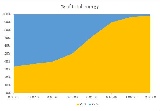
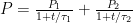
The charts above show the distribution among the two hypothetical energy systems P1 and P2 as a function of time, for two different combinations of fit parameters, demonstrating that we can use it to distinguish between sprinters (more blue) and stayers (more yellow) independent of the absolute power values.
Using the improved CP model to categorize rowers
The Concept2 rankings give access to a big database of self reported and verified indoor rower results on ranking pieces. In this section, we’re using that data set to develop a metric to distinguish the stayers from the sprinters, or the Indoor Rowing “Kenyans” from the “Jamaicans”. Instead of just playing around with the data and postulating my metric, I have used some methods from the field of Machine Learning. This allowed me to figure out which metric is best at separating the sprinters from the stayers.
What we did was:
- Download all ranking results for all ranking pieces for one season (2016)
- Organize the data from the athlete perspective, i.e. find all ranking distance results for each unique name in the database
- Remove athletes with fewer than four distances ranked
- Per athlete, fit the ranking results to the improved CP model from the previous section. This allows us to calculate “synthetic” results for all ranking pieces for all athletes, even if they didn’t row a particular piece
- To remove dependence on absolute performance, we only look at power ratios between time based pieces. For each athlete, we calculate the ratio of 10 second power vs 4 minute power, 4 minute power vs 1 hour power, etc.
To feed the learning algorithm, we need an objective way to find typical “stayers”, “allrounders” and “sprinters” in our athlete population, and use this to “train” the system. I used the following definition:
- A “stayer” is an athlete who is
- in the top 25% of the ranking (for their age/gender/weight group) for the long pieces (10k and longer)
- in the top 25% for the middle distances (1k, 2k, 5k, 6k) and
- not in the top 25% for the short pieces (500m and shorter)
- A “sprinter” is an athlete who is
- in the top 25% for the 500m and shorter pieces,
- in the top 25% for the middle distances (1k, 2k, 5k and 6k)
- but is not in the top 25% for the 10k and longer
- An “allrounder” is an athlete who is
- in the top 25% of the ranking for all distance ranges
- “Unable to categorize” are all the remaining rowers. (They will be categorized after we have developed our sorting algorithm.)
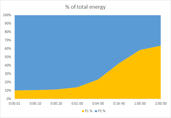
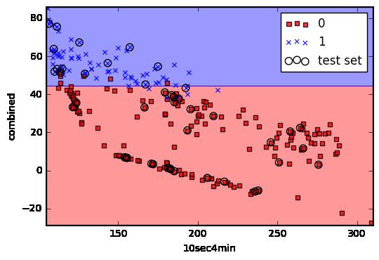
The following chart shows our distribution of sprinters (blue crosses), stayers (red squares) and allrounders (green circles) in a 2 dimensional space defined by the ratio of their 1h to 4 minute power ratio (vertical) and their 10 sec to 4 min ratio (horizontal). The axes values have been standardized for the purpose of the machine learning algorithms.

This quickly showed us that, using these metrics, the “allrounder” category is very similar to the stayer group. In fact, allrounders looked a lot like stayers for all combinations of parameters we tried. We decided to remove the allrounders from our learning algorithms and focus on the differences between the “pure” stayers and “pure” sprinters.
First, we performed a sensitivity analysis against the different metrics that we had (basically power ratios between all combinations of ranking durations, plus normalized combinations of the four fit parameters of our improved CP model. It turned out that the highest sensitivity was found for:
- The ratio of 1 hour power and 4 minute power
- The ratio of 10 second power and 4 minute power
As the chart below shows, the 1h vs 4 minute ratio has a stronger predictive power than the 10 second vs 4 min power.
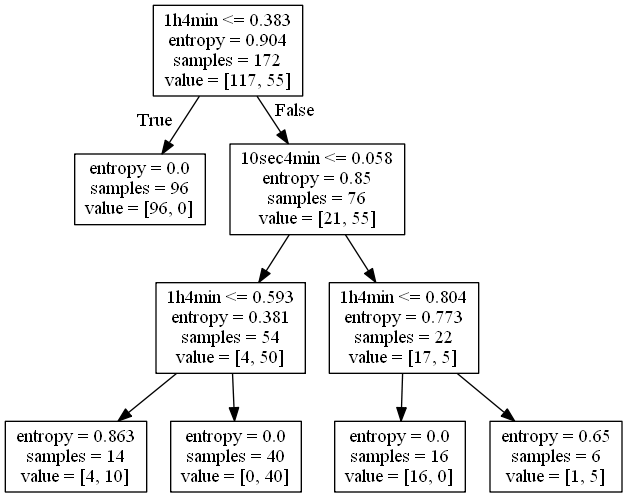
For fun, we let the learning algorithms build a decision tree:
However, in the end we settled on using a combination of the two ratios (1h/4min and 10sec/4min) and use that:
This “combined” metric basically measures how steep the drop of in power with duration is for two parts of the CP curve, the left part which measures pure sprint 10 second power bursts vs a typical 4 minute middle distance effort, and the right part which measures how much of that 4 minute middle distance power the athlete is able to maintain over a 1 hour row.
This combined metric gives us something we could call a “stayer value” (or “sprinter value”). To normalize it to a “score” between 0 and 100, we convert this to a percentile score in the distribution of all results. This is our “stayer score”.
A stayer score of 0% means that you are the most “Jamaican” type of the typical indoor rowing population, and 100% means that there is nobody as “Kenyan” as you are. This is measured across the entire population, ignoring age, gender and weight groups.

In the example CP chart above, a stayer score of 56% means that 56% of the population has better “sprinter” capabilities than the athlete in question. This does, however, not mean that 56% of the population has a better score on, say, the 100m ranking distance. This can be seen from the dashed lines, representing the average positions of the percentile scores for the different durations, for the age/gender/weight group this athlete is in. Compared to his age/gender/weight population, this person is somewhere between the 75% and 90% percentile, which is pretty good (or at least better than most).
Going back to the “allrounders”, athletes who are in the top 25% of their age/gender/weight category ranking, their “stayer score” is, as expected, 30-35% and up.
Speaking of the indoor rowing population. When we played with the Concept2 rankings, we also analyzed some interesting population trends, especially differences between age groups in terms of sprinter/stayer balance. We we will keep this for a separate article.
Conclusions
This article has described some of the science we used on rowsandall.com to obtain reliable answers to the following questions:
- How good is my certain erg score compared to the World’s best (for my age/gender/weight group)
- How good is my score compared to the average rowing population (again for my age/gender/weight group)
- Where are my weak spots. Should I improve my erg score on the shorter distances or focus on the longer ones?
We have found a way to remove outliers for the Indoor Rowing World Records and thus obtain a consistent score for “World Class” performance. This enabled us to give athletes a fair comparison of their efforts with world class, without being punished for being in a cohort with an exceptionally strong world record holder.
We have also confirmed the common idea that lightweight rowers are better stayers than heavyweight rowers, at the World Record level, by comparing their long distance world record power relative to the 4 minute power.
Trying to assess what distinguish a “sprinter” from a “stayer” independent of the absolute performance led us to a discussion of Kurt Jensen’s power ratios and “Paul’s law” for indoor rowing. We then introduced a Critical Power model that takes away some of the drawbacks of Paul’s Law and Jensen’s Ratios. Using this model and the results from the Concept2 rankings, we found a metric to measure rowers on the sprinter/stayer axis. This gives us a “Stayer Score” which our rowsandall.com users will find useful to assess their relative strengths and weaknesses.
- The Concept2 ranking pieces are 100m, 1 minute, 500m, 4 minutes, 1000m, 2000m, 5000m, 6000m, 30 minutes, 10k, 60 minutes, and the Half and Full Marathon ↩
- The indoor rowing season, as defined by Concept2, runs from May to May. ↩
- I am sticking to the US spelling. In Dutch, we would write Joan van Blom with a small v. ↩
- A percentile of 75% means that 75% of the people who ranked this piece were slower than you. ↩