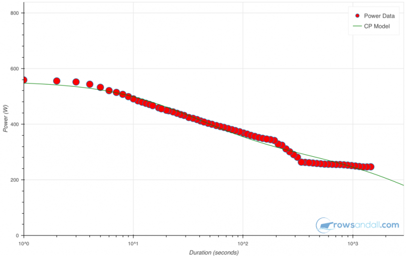
The chart above is the Critical Power (CP) chart as calculated for me by rowsandall.com. In this post, I will go through the science and non-science behind it. I hope that my explanation will help improve your understanding and help you use it to measure training results and prepare a race plan.
The CP chart tells you how hard you can pull (in Watts) for how long. Rowing is about maximum speed over a given distance, but speed depends on external factors (wind and current mainly), it is impossible to use speed as a measure for training progress. The relationship between speed (the result) and power (how hard you are working) also depends on weight and on your rowing technique, but for a given athlete, the power in has a very high correlation with speed out, so the goal of training should be to manage a power as high as possible over a given time which represents a typical duration of your race.
In the chart above, for example, I might want to improve my power over 4 minutes, as that is the rough duration of a 1k race in a single.
But first, how does the graph get its shape, and can you really move it?
Many of you may be familiar with the different energy pathways, but even if you aren’t, you know that you can hold a much higher power over short durations than over longer durations. Almost as if you have some energy stored in your body, and you have to chose between expending it all at once, or spread it out over a long duration. We also know that the power drop between a 1 hour maximum effort and a 2 hour maximum effort is much smaller than the power drop between 2 minutes and ten minutes. It is almost as if there is a power level that you can sustain forever.
This is exactly how initial Critical Power theories began [Scherrer and Monod]. The authors of the cited paper postulated a critical power CP that can be sustained forever, and a finite energy W that can be used until it is depleted. Thus the total power that you can hold is
P = CP + W/t,
Or solving for t, the time (in seconds):
t = W / (P – CP ) – for power above CP
with:
t – time (seconds)
W – Power (Watt)
CP – Critical Power (Watt)
I will explain later why I stopped liking this equation, but the beauty is in its simplicity, and all other equations used refer back to this one and are basically improved versions trying to match real observations. It is tempting to relate W to your anaerobic capacity and CP to your aerobic fitness, and I am not against that, but be aware that there is not only one anaerobic energy pathway, and also that there is a complex interaction between the energy pathways. You cannot switch them on independently. Even worse, the balance between the different pathways depends not only on the power level P, but also on the history. Without a proper warming up, you will end up relying much more on your anaerobic pathways.
So what is wrong with the simple equation?
- At very short durations, the equation predicts very high power. We all know that everybody has a limit to your sprint work rate, so a realistic equations should flatten off at shorter times
- We also know that there is no energy pathway that can work forever. Your two hour power will be higher than your 4 hour power, which will be higher than your 10 hour power.
So we should add some modifications to allow for this behaviour. The scientific literature is full of alternative equations. Some try to describe in detail the different energy pathways, and claim to even be able to describe regeneration (of W, or the equivalent in the given framework), and could thus be useful for cycling races with a lot of speed variations. The downside is that, while trying to remain closer to physiology, the alternative equations start to have many parameters. Where the original equation had only 2 parameters, W and CP, which you can vary to match your measured performance, some alternatives go above 10 or 11 parameters. See this link for a few examples:
http://veloclinic.com/wp-content/uploads/2014/04/PowerModelDerivation-1.pdfThe problem with that is that you need extremely reliable and accurate measurements to use that. If you don’t, and in rowing we don’t, believe me, you end up overfitting your data and you lose all predictive value. Even worse, there might be different combinations that give equally good fits to the data, but with very different predictions between the data point.
This is illustrated well in the chart above. In terms of predictive value, the linear (straight line) fit may be better than the curved line which is a clear example of overfitting to a polynomial by too many free parameters. If you would add a new, measured data point and repeated the fit, it would probably not alter the slope of the straight line much, but the polynomial might very well look entirely different.
In rowing, we are mainly interested in constant effort over a given duration. We are not climbing any cols and we are typically not racing over several hours. The rowing movement divides effort in discrete strokes of a typical duration of 1.5 to 3 seconds. There are no races over 50m, so our ‘maximum’ power is really only the power we can hold over a few strokes, so at shorter durations our measured data typically flatten off much more than in cycling. Also, the current power meters record quite a large spread of data from stroke to stroke. Some of that is measurement accuracy (noise) and some of that is variations isn stroke length and drive force.
So in the end I settled for a 4 parameter fit function from the veloclinic link above:
P = CP1/(1+t/tau1) + CP2/(1+t/tau2)
In this equation, the maximum power at short durations equals CP1 + CP2. The time constants tau1 and tau2 determine the position and the slope of the transition between sprint power levels and endurance power levels. Finally, note that the equation does correctly continue to predict lower and lower power as exercise duration increases.
Looking at my own CP chart, you can see one of the issues with the fit. The red dots are data points found in my workouts. Each dot represents an actual duration over which I have held a certain power value. Be aware, if each red dot was a maximum effort over that given duration, I would not be able to reproduce the actual graph from one workout. The reason for that is that the dot represents not the actual power at that time, but an average over such a duration, and at max effort, so after that time I should collapse and not be able to row one more stroke.
In my case, only two actual workouts dominate the graph. One is a 6k race, and the other is a 1k race. And as we try to hold a constant power during the race, you can see the transition after the 4 minute mark, and a relatively flat series of red dots, which originate from the 6k race.
That means that between 4 and 24 minutes, I will probably be able to do better than the red curve suggests, and the blue line which is the curve fit has some duration values where it shows that. However, there is still good reason to believe that the line is an underestimation of my true capacity, as in this case the fitted parameters are fitted to a larger number of segments that are part of a longer race.
As you add more workouts to the pool of ranking workouts, the chances of getting closer to your true CP graph increase. But you are then also averaging over a longer time period, and perhaps your fitness evolved over that period. In the near future, I will improve the fitting algorithm to give more weight to the end points, which will lead to a slight improvement. Still, I think the graph gives very good guidance on what power you can hold for how long, and also is a useful feature to see if your fitness improves, especially on the water, where time over a given distance is influenced by wind, current, water temperature, chop, and your technique.
Like this:
Like Loading...
Related


