There have been a few upgrades on rowsandall.com, recently, and in this post I want to introduce you to the world of statistics that we are trying to demystify for rowers. As always, on rowsandall.com, our approach is to try many ways to represent your data and let the community discuss and decide what makes sense and what doesn’t. So here we go!
Aggregate Stats
In the previous post, I discussed workout specific stats. This post will discuss looking at statistics over a period of time. Rowsandall.com Premium users can surf to this page:
https://rowsandall.com/rowers/cumstats/
If you’re not logged in to rowsandall.com, the site will redirect you through the login screen. If you don’t have a rowsandall.com Premium account, get a free account first and then upgrade using the PayPal upgrade button. The costs are only 15 EURO per year, and you get access to a lot more great features. Aggregate Stats, for example:
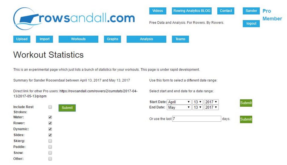
On the top of this page, you see a few forms that allow you to select the workout type and the date range that you want to look at. The default selection is the last 30 days.
Scrolling down, you see something that is very similar to the individual workout stats page, so I will not explain it again.
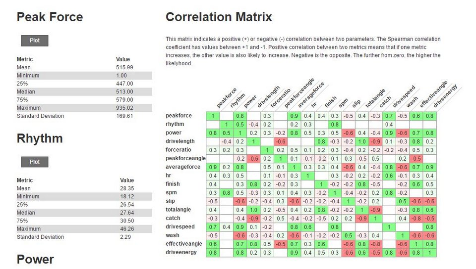
The difference is that the correlation matrix and the metrics values are now calculated for all workouts that you have selected in the given date range, so here is a change to learn something about all your strokes.
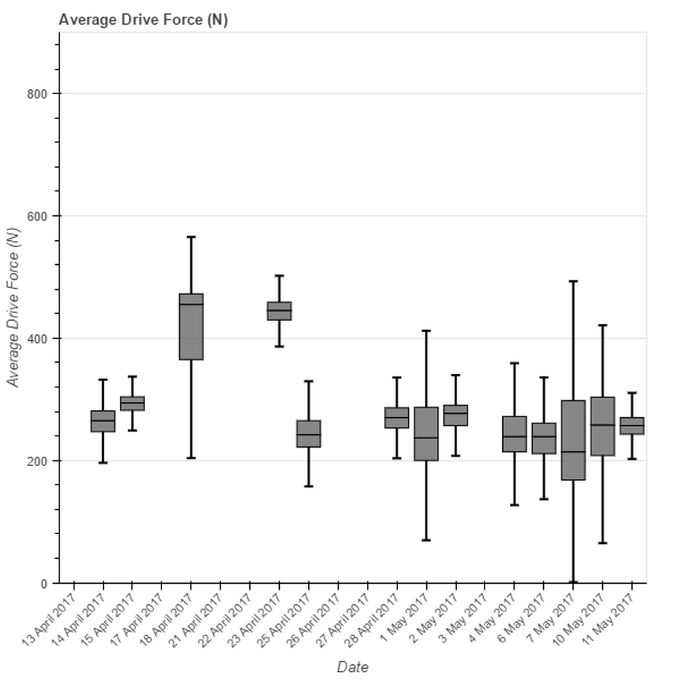
The other difference is the “Plot” button under the name of each of the metrics. That plot button generates the “box plot” for that specific metric, on the right-hand side below the correlation matrix. Here is an example:

So, there is really no reason to be afraid of box plots once you understand what they mean. Each point on the box plot is a representation of the distribution of the metric (average drive force in the example image above) averaged over all strokes taken on that day. Let’s zoom in to May 1 on the plot above. Above the “1 May 2017” label, you see a gray box with some lines extending from the box (“whiskers”, hence the name “box-and-whisker diagram”).
The bottom of the box indicates the first quartile (the 25% value in the metrics tables on the left), and the top of the box indicates the value of the third quartile (75%). So 50% of your strokes on that day are at values inside the box. The median value is indicated with the horizontal line inside the box.
The whiskers indicate the spread of all data (excluding a few obvious outliers).
In contrast to the averages on the left of the aggregate stats page, the box-and-whisker diagram is a nice way to visually represent the evolution of a metric. You can quickly pick “good” and “bad” days in your training history (and then head over to that particular training record to look at the detailed data).
Here is another example:
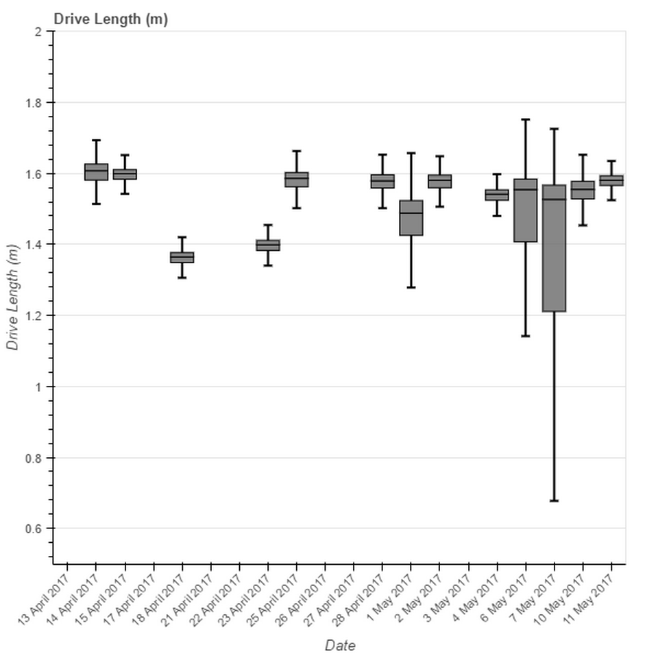
This particular plot is for drive length, which should be (1) long, (2) very consistent from stroke to stroke, and (3) consistent from day to day. What are we seeing in this particular example? Mostly consistent days, but there are four training days where we should take a deeper look at the data.
For OTW rowers with an NK Empower Oarlock, here is an example of a box plot for the Wash metric:
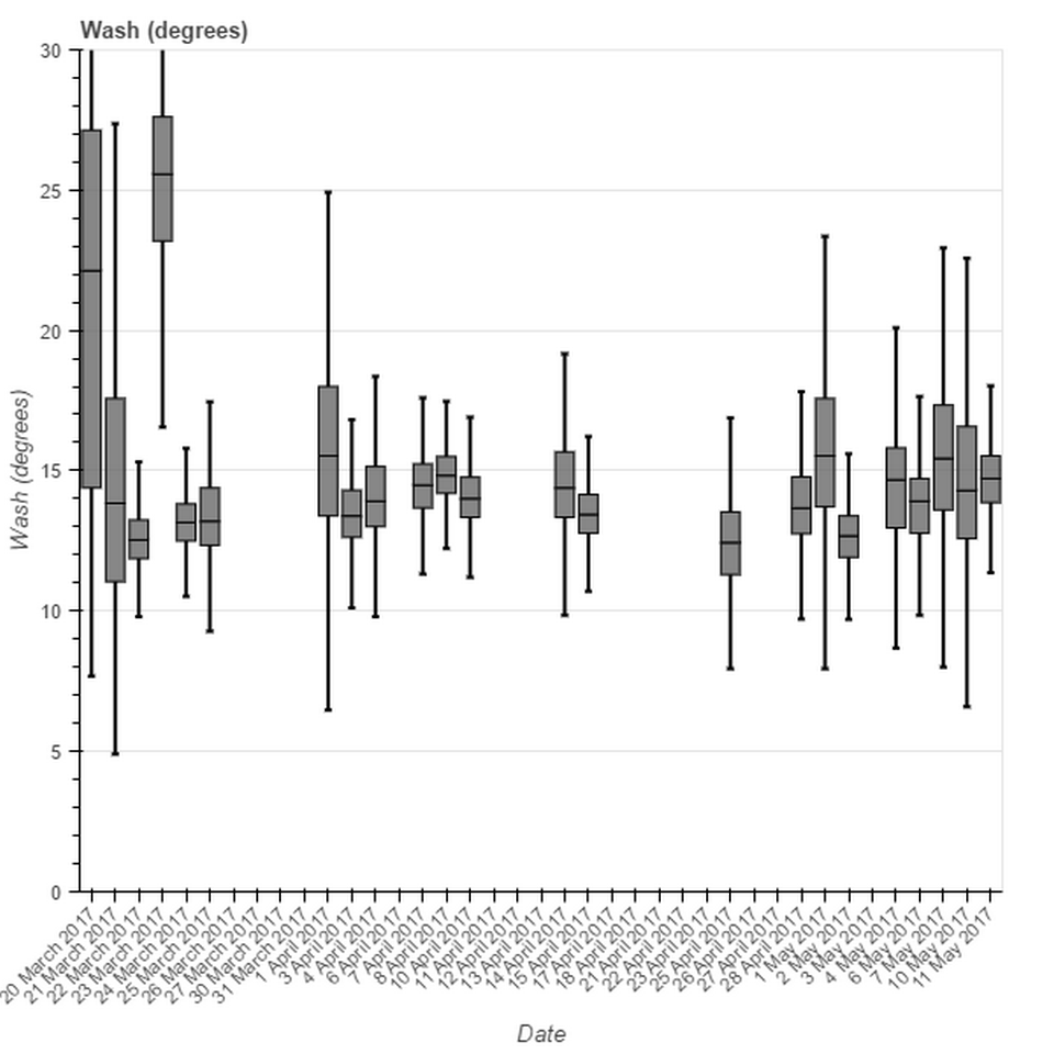
I have taken a bit longer time interval. I have tried to work on improving my wash numbers over the past two months. Does the plot indicate an improvement? Hard to say, but the answer is probably “No”, although there has been a period in April where the data are more consistent, and recently it has started to diverge again.
I think that generating these plots regularly, let’s say on a weekly basis, is a nice way to take a snapshot of the past week, and picking out the “bad” workouts, or look for trends. You can look for trends in the median value, but you should not forget to look for trends in the spread, which can be easily done by eyeballing the box sizes.
