A question from one of my users:
“How do I view the horizontally stacked graphs that you often show in your blog with all the major data at once?”
Here is the answer:
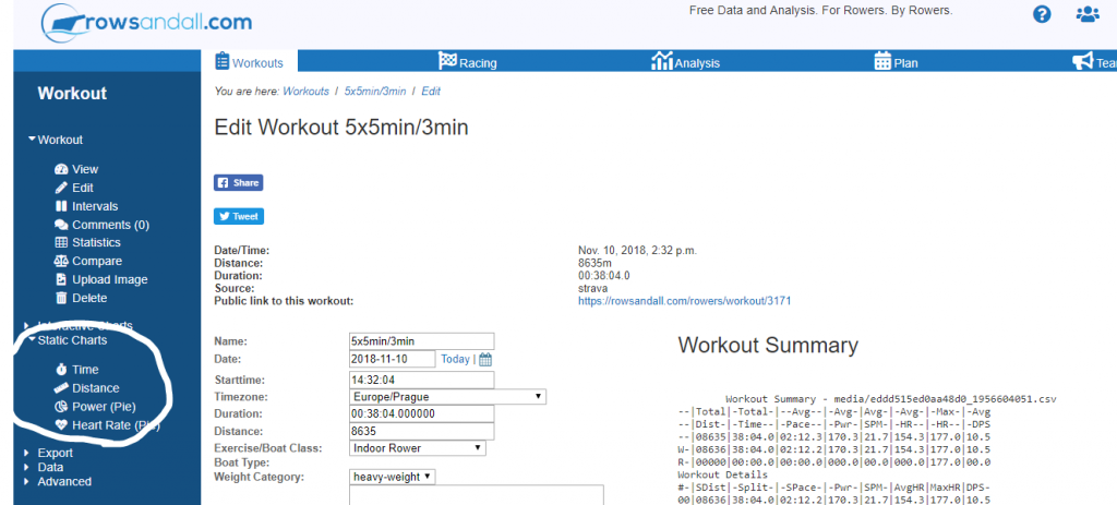
These charts are called “Static Charts” on rowsandall.com, to distinguish them from the “interactive” charts that are created elsewhere. The site creates an image file for you which is stored on the rowsandall.com server. You can download the file or use the link address to include the image into your training diary, blog, or share it on social media.
There are a couple of pre-defined static charts:
- Time – a stacked chart with time as the x axis
- Distance – a stacked chart with distance as the x axis
- Power (pie) – a pie chart of the time spent in your power zones (more about zones below)
- Heart Rate (pie) – a pie chart of the time spent in your heart rate zones
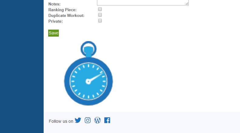
When you click on the link, you won’t get the image immediately. The image creation is delegated to a background task, and instead of the image you will see a rowing stopwatch, like this:
Once the image is done, the stopwatch is replaced by the image:
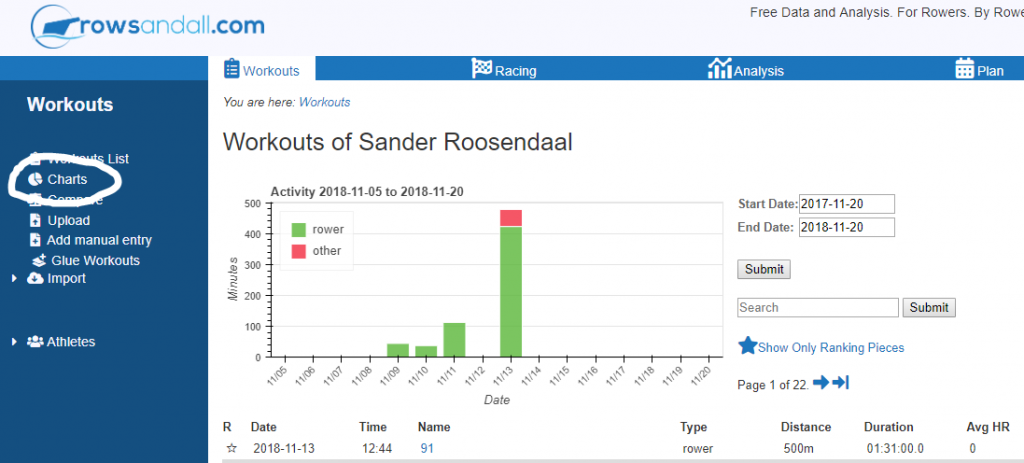
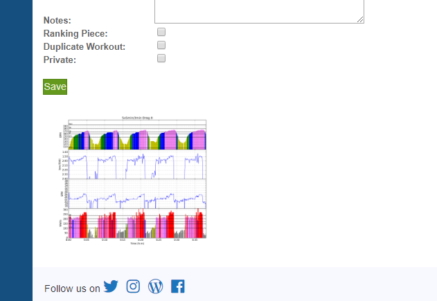 There are several pages where the images are shown. These are the workout Edit page (by default), the workout “view” page (if configured like that), and the page that is shared to twitter or facebook when you click on the sharing icons. Finally, all images are collected on the “charts” link that is accessible from the Workouts List:
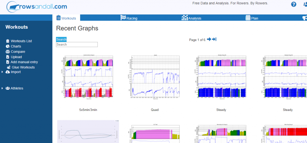
Clicking on the “Charts” link brings you to a page that looks like this:
You can search the charts by the name of the workout. Clicking on the chart thumbnail brings you to the chart page, where you can download the image:
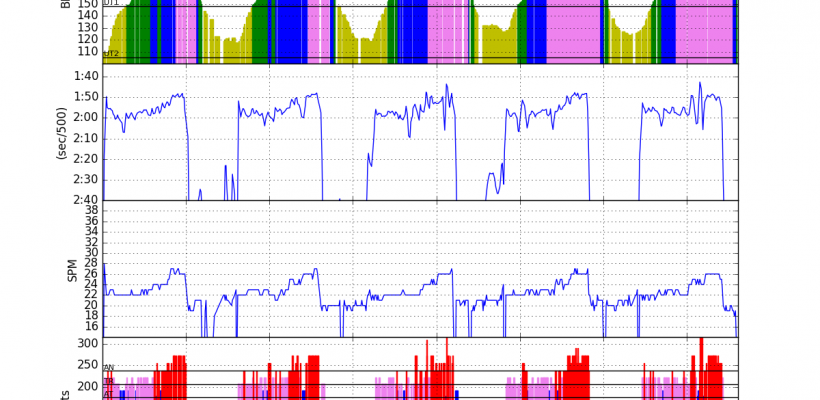
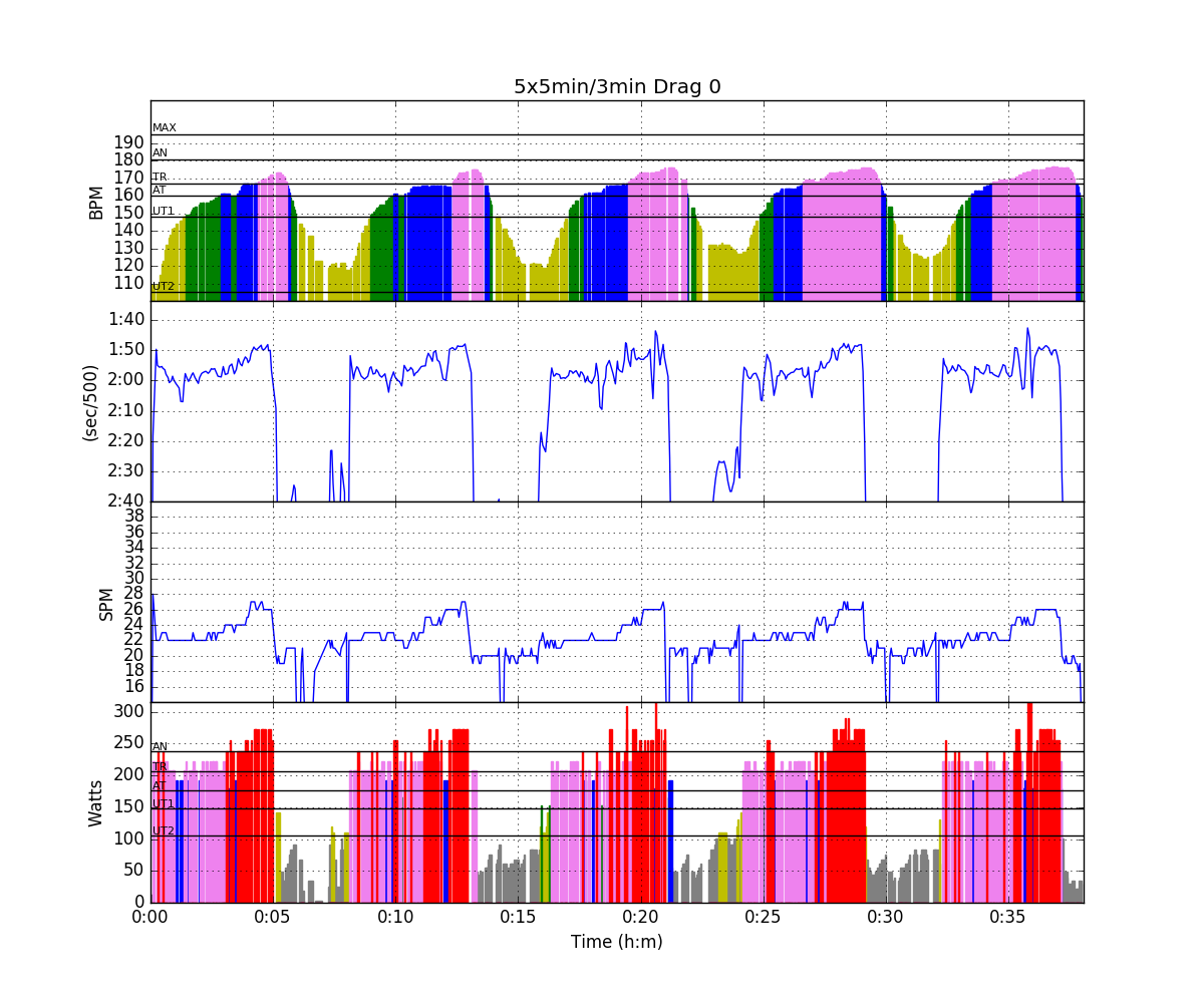 From top to bottom, this chart shows your heart rate, pace (sec/500m), stroke rate SPM, and power in Watts. The nice little colors are inspired by the charts that were generated from RowPro row files in an Excel spreadsheet developed by a guy named Dan Burpee. They show by color coding in which power or heart rate zone you were working out. These color codes are extremely useful as they help you seeing how hard you worked at a glance.
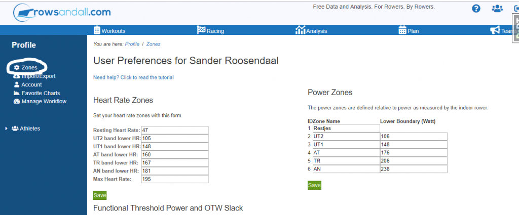
These are personal zones, and you can define their values in the user settings:
This article will not go into depth explaining how to determine your heart rate zones. Here is a link to a summary of the zones we use on rowsandall.com, including a nice calculator to get an estimate based on your resting and maximum heart rate.
For power zones, there are various systems in use, so rowsandall.com allows you to name the zones and define their lower boundary in Watt.

