In my last article, I showed how you can use the Trend Flex chart to discover correlations in your stroke data. I selected my last three months of rowing in the single, restricted the analysis to stroke rates above 30spm because I want to look at race pace, and the work per stroke above 400 J to exclude any technique drills or short strokes.
I plotted pace vs power. Power is how hard you work. Well, in fact it is the mechanical part of it, as measured on the oarlock using the NK Empower Oarlock. Still a good measure for how hard you are working. On the vertical axis, I plotted pace, which is a measure of boat speed. Boat speed wins races. In contrast to the erg, on the water speed doesn’t follow a simple relationship with power. Technique, skill, and efficiency come into play. As well as the weather. This being the past three months of one rower, technique and skill are assumed to be constant. We also assume that the weather averages out.
The cool thing about the Trend Flex chart is that your data of speed vs power are grouped by a third parameter. That enables you to look at correlations (not causation, as one reader correctly pointed out) of efficiency with a third parameter. In the previous article I looked mainly at angle related metrics: catch angle, finish angle, drive arc, slip and wash.
Today, I am going to look at two other parameters.
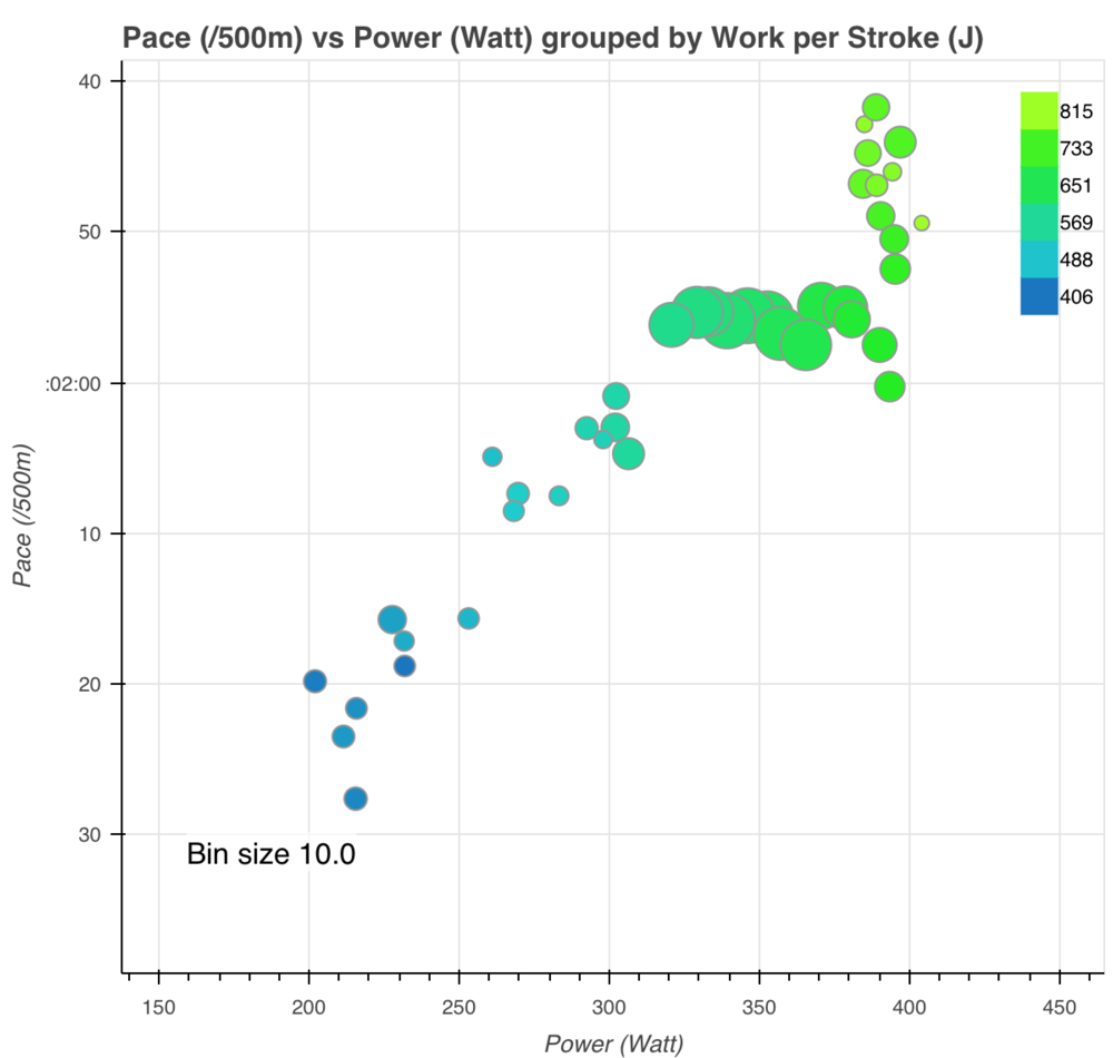
The first one that interests me is Work per Stroke. This is basically the area under your force curve, so it is directly related to stroke length and average drive force. It is interesting to note that increasing power at constant work per stroke is only possible by increasing the stroke rate.
The chart is very interesting. There seems to be a flattening that happens around 590 J. Somewhere between 320W and 400W, my more powerful strokes are less efficient (i.e. On average not faster) than the lighter strokes. Lighten up!
The funny thing is that around 400W there are some very powerful strokes that go up a lot in terms of boat speed. I am wondering what is going on there. Perhaps these are strokes from the first part of intervals, where I am going at an unsustainable speed? The bubbles in the chart are much smaller, indicating that there is not a very large number of these strokes in the analysis.
Anyway, for me, these power levels are unsustainable over a 1k race, so I better not look at them. The lesson really is that 550 to 600 J is the Work per Stroke range I should be working in.
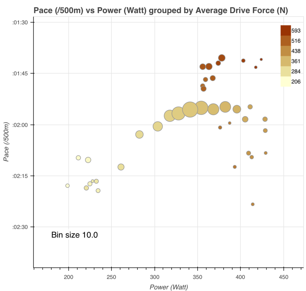
As Work per Stroke is a combination of the drive length and drive force, let’s look at average drive force next.
Interestingly, this shows a similar pattern, but the groups of data sre much more saturated. For most of my strokes (the large bubbles), above a certain value increasing the drive force doesn’t pay off. On average, I am just increasing the power (speeding up fatigue) but not gaining any boat speed for it.
However, there is a small number of strokes where I have both a powerful drive and a high boat speed. I suspect that these strokes are from the beginning of the race or training interval. Perhaps I can row those powerful strokes before my body switches to aerobic energy pathways. Perhaps it is a sign of my technique deteriorating when I try to pull hard in the second half of the race.
With these valuable observations from the Trend Flex chart, I can go back to monitoring the stroke metrics in my day to day training and try to figure out what causes these correlations.
And in races, in the second half, I should rate up instead of putting more grunt in my strokes, when I see the power values drop.
In conclusion, if you use a power meter, the Trend Flex is a very useful tool to discover trends and ask yourself questions about the efficiency of your rowing. Combined with video analysis and monitoring the metrics in your day to day rowing, this enables you (and your coach) to achieve your most efficient stroke.
Do not hesitate to contact me if you want to try this approach on your own rowing.


