There have been a few upgrades on rowsandall.com, recently, and in this post I want to introduce you to the world of statistics that we are trying to demystify for rowers. As always, on rowsandall.com, our approach is to try many ways to represent your data and let the community discuss and decide what makes sense and what doesn’t. So here we go!
Workout Specific Stats
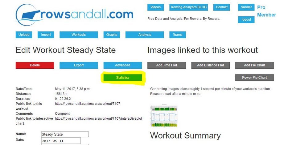
Open a recent workout by going to the Workouts page, then clicking on the name of the workout. Then click on the “Statistics” button.

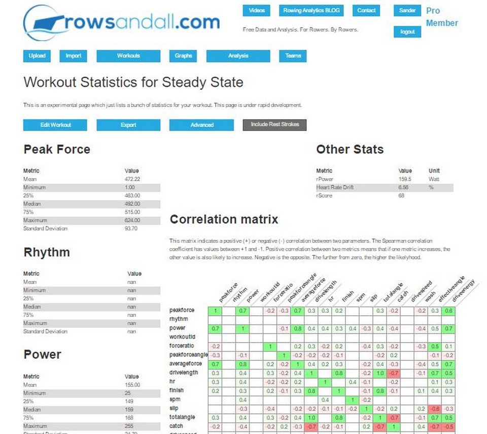
This, not so surprisingly, brings you to the statistics page, which looks as follows:

The Metrics
On the left, you see all the metrics. Which ones make sense depends on which data you captured, which depends on whether this was an indoor or on-the-water row, and which app or device you used to capture the data. Almost always there will be SPM (strokes per minute), so let’s focus on this metric. Scroll down until you see SPM:

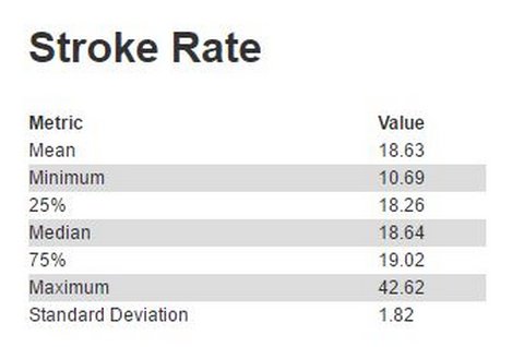
From top to bottom, in this little table, we see Mean, Minimum, 25%, Median, 75%, Maximum and Standard Deviation. What does this all mean?
Think of the 1000 or so strokes you did in this workout. Each stroke has a slightly different duration, and each of them has a different stroke rate value. Perhaps you were trying to hold 19spm in this steady state workout, but of course you saw the incidental 18spm or 20spm on the display.
The Mean is just the mean value of all your strokes, averaged over the entire workout.
The minimum and maximum are also just that. Looking at the table on the left, I did a stroke at 10spm, and at least one at almost 43spm. The high value probably was from a few arms only strokes, and the lowest one was probably from rowing with pauses. This is not so interesting.
The 25% and 75% values are more interesting. They are the first and third quartile. The 25% value was, in the example, 18.26 spm. What does this mean? It means that 25% of the strokes were at a stroke rate lower than 18.26spm. Similarly, 25% of the strokes were done at a stroke rate higher than 75%. That already shows that I managed to row this workout in a pretty small band of stroke rates. The 10spm and 43spm values are really just outliers.
The median value indicates the second quartile. Exactly half the strokes are at values lower than this. This value sometimes differers substantially from the mean, especially when you are rowing intervals. I find it a more useful metric than the mean. Imaging you were doing intervals at 30spm with rests paddled at 20spm. If the rest intervals are 40 strokes long and the work intervals 30 strokes, then the mean stroke rate will be 23.3spm, but the median will be the value of the 35th stroke, which is 20spm.
The standard deviation is a measure of the dispersion of your data. A low standard deviation indicates that the data points tend to be close to the mean, while a high standard deviation indicates that the data points are spread out over a wider range of values. For some metrics, like for example stroke length, or catch angle, you want a small standard deviation. For some workouts, the standard deviation doesn’t make sense, for example power, or stroke rate in an interval workout with rest intervals.
Don’t forget to scroll down all the way down to see all the other stats. There are many of them.
Other Stats
On the top right of the workout statistics page, there the so-called “other” stats. Today, there are three of them, but we intend to expand this.
The first metric is rPower. This metric is calculated using the same formula as TrainingPeak’s trademarked Normalized Power. (I am trying to avoid the trademarked names, but it is ok to use the equations as they were published in the book Training and Racing with a Power Meter – see the link below this blog post.) What it tries to estimate is the power you would have to row the workout at constant power to achieve the same level of fatigue. Especially for interval workouts, this value is a lot more useful to look at than the average power. If you would alternate 5 minute intervals at 150 and 300W, the average power is 225W. However, the rPower value would be 270W, and it tries to say that 10 minutes at 270W is roughly equivalent to 5 minutes at 150W followed by 5 minutes at 300W.
The next metric is heart rate drift, calculated as defined here. A lower number indicates a better level of fitness. A higher number could be a result of dehydration or of a lower level of fitness. Working out in a hot environment also “helps” to increase this number, as does skipping the warming-up. As the value is calculated by comparing the first and second half of a workout, and correcting for differences in power, it should be a pretty good estimate, but I would personally only look at this value for steady state workouts, and take values for interval workouts with a grain of salt.
Finally, there is the rScore, which is calculated with the same equation as TrainingPeak’s trademarked Training Stress Score (TSS). It is a number that tries to quantify the training effect, which is a product of the workout’s duration and it’s intensity.
If you are on TrainingPeaks, you will be familiar with these metrics. The values calculated here may differ slightly from what TrainingPeaks reports from the same workout. The difference is in how TP and Rowsandall.com treat rest periods or periods with no activity. There is also a bit of Secret Sauce involved on the TrainingPeaks end to make the numbers more robust.
Correlation Matrix
The matrix. This matrix indicates a positive (+) or negative (-) correlation between two parameters. The Spearman correlation coefficient has values between +1 and -1. Positive correlation between two metrics means that if one metric increases, the other value is also likely to increase. Negative is the opposite. The further from zero, the higher the likelyhood.
Of course it is important to keep in mind that correlation doesn’t necessarily mean causation. But still it makes sense to take a quick glance at the dark and light values and try to make sense of them.
Remember:

[amazon_link asins=’1934030554,1937715566′ template=’ProductCarousel’ store=’rowingdata-20′ marketplace=’US’ link_id=’99d8e628-37e0-11e7-8bc0-a13272937564′]
