

The is the first in what will be a continuing series of articles about using data and analysis to improve rowing performance. The purpose of this article is to define some terms and explain how measuring and tracking these parameters can help make you a better rower.
Let’s start with what better rower means. In this context, better means faster. More specifically, it means to improve your performance for a specific competitive event. This could be a standard 2000m indoor race, one of many internet based challenges, or even one of the standard ranking events maintained on the concept2 website.
Many people row for enjoyment or to generally improve their health and fitness and have no need or desire to track the details of workouts. However, if you have a competitive personality or are motivated by seeing improvement, indoor rowing provides tons of data to help you.
This data is useful in real time, while you are rowing. It can also be useful to use this data afterwards to gain insights about what you are doing and how you can improve.
Let’s review the basic parameters that you will see on the Concept2 Performance Monitor
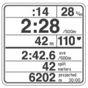
Pace / Power / Calories
These are three different ways to measure exactly the same thing…Power
- Power: Measured in watts. This is the most direct form of the measurement of what you are doing on the erg. The performance monitor measures the speed that the flywheel is spinning and using a formula related to its inertia, calculates how much energy the rower put into it. Obviously, the bigger the number, the harder you are working.
- Pace: Measured in time to travel 500m. It is usually just written as a time; for example 1:45.0. Obviously, the erg isn’t moving, so this is a simulated measurement. According to the Concept2 website, it is supposed to calibrated to match the effort to get the equivalent pace in a Straight Four (assuming you had 3 other identical rowers!). The faster you are going, the smaller the number will be.
An important thing to remember about pace is that it is a non linear measure. In other words, it requires more effort to drop your pace from 1:50.0 to 1:45.0 than it does to drop you pace from 2:00.0 to 1:55.0. Pace is the most common unit used among rowers when discussing erg pieces.
I find it convenient that a 2:00.0 pace is just about 200W, actually 203W. But it’s a useful way to keep track. - Calories: If you use this measure, you are likely a Crossfitter and I don’t think I can help you.
Stroke Rate
The number of strokes a rower takes per minute is a major factor in the power (or pace) that is achieved. It is, however, not the only thing involved. The other is how much ooomph is put into each stroke. Many workouts will have specific guidelines about the stroke rate.
In general, higher stroke rates are used for shorter, faster pieces and lower stroke rate for longer, endurance pieces. Practically speaking, stroke rates vary from about 15 SPM (stroke per minute) all the way up to 60 SPM. Often smaller and lighter rowers will row with higher stroke rates and bigger rowers with lower stroke rates.
Heart Rate
The Concept2 Performance Monitor provide the ability to connect a heart rate sensor and see your heart rate in real time.
- The PM3 supports Polar Standard sensors with an add on accessory available from Concept2
- The PM4 supports ANT+ sensors
- The PM5 supports ANT+ and Bluetooth Sensors
Many rowers use Heart Rate Based training techniques which employ specific heart rate ranges (or bands or zones) to manage the intensity of a training session. There will be one or more articles about this coming soon.
Before you row
To make your training more effective, have a plan in mind before you start. Of course you can change your mind if it isn’t working out. The plan does not need to be elaborate, but it should include the following:
- Objective: What is the specific purpose of the workout. Are you trying to improve endurance? Power? Efficiency? Technqiue? You should understand how what you are going to do will improve some aspect of your rowing.
Examples:- Improve endurance with long steady state rowing
- Improve power with short sprints
- Improve efficiency with long intervals
- Pace or Power Target: Some workouts are segmented so there could be different targets for different parts, but you should always know what pace you are trying to maintain.
- Stroke Rate: In some workouts you will just want to find the most comfortable and efficient rate for the pace target. In other workouts, you will want to set a specific rate target for each segment of the workout.
- Heart Rate: If you are using heart rate monitoring as part of your training plan, you will likely want to set a specific target. For example in an endurance session, you might want to keep your heart rate between 60% and 80% of your maximum heart rate. For a high intensity workout, you may want to watch to see if you are really putting everything into your last few reps by seeing if you get your heart rate to 95% of your max or higher.
While You Row
It’s pretty basic. Try to hit your targets. A little bit of variation is OK, but consistency is efficiency. If you are rowing to Watts, try to get each stroke within +/-3 watts of your target. If you are rowing to pace, try to hit your pace +/- 1sec. Try to hit your rate target exactly, but it will also want to hunt around by +/-1 SPM. The thing to keep in mind is to try to visually average the power and pace around your target. For pace and watts, you can use the “ave” field to keep on track.
After you row
There are a number of ways to capture and collect the data from the PM while you row. That’s another topic for another article. But briefly, you can use RowPro, ErgData, PainSled, or a few other applications to grab the data. That data can then be used after your workout to see how well you executed your workout plan.
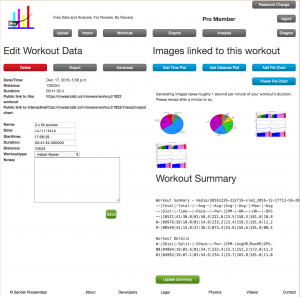
This is where rowsandall comes into the picture. You can import your rowing data to rowsandall directly from the Concept2 logbook, or by email or by manually uploading data. Once it is there you have some basic tools to help you figure out how your workout went.
To help describe how to use the distance and time plots, let’s look at a 10K session that I did a while ago. This was intended to be a threshold type workout that was divided into 2 – 5 K pieces with a two minute rest between them. In each 5k piece, I started at a moderate pace, a couple of splits faster than the pace that I use for long steady state endurance rowing. Then after each 1000m segment, I would increase my speed by a split. So, I started at a 2:00 pace, then 1:59, 1:58, etc. I rowed this workout without any rate restrictions or heart rate targets. I used an app called PainSled on the iPhone, connected to the PM5 on the erg. To record heart rate, I used a Wahoo Tickr heart rate strap which was paired with the PM5. After the workout, I uploaded the workout data from Painsled to rowsandall.com for analysis.
Once it’s up on the site, you can go to the “Edit Workout” Page by clicking the workout name.
Time Plot / Distance Plot
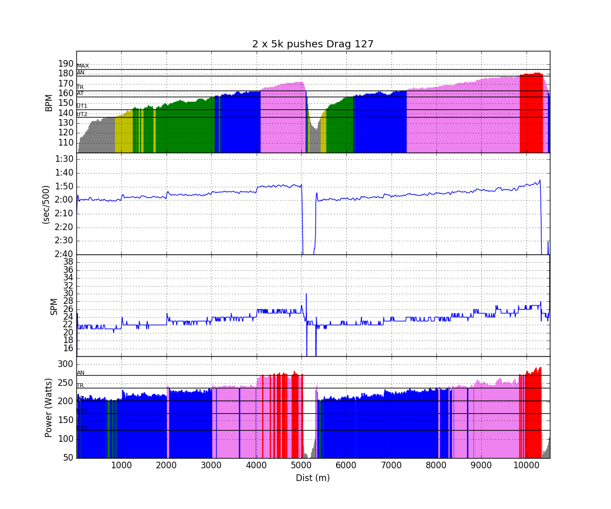
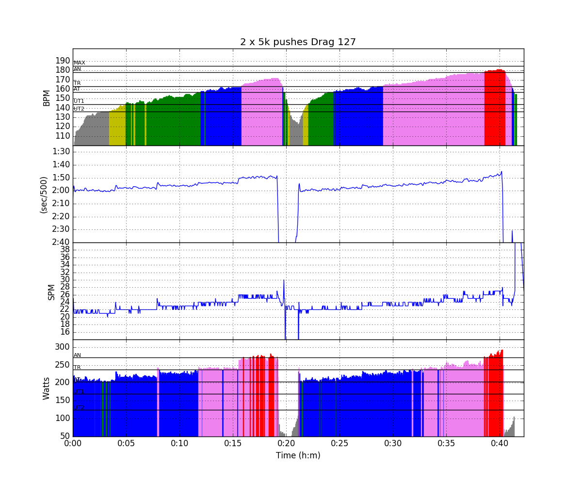
The most basic analysis is the time or distance plot. Generally, workouts will either be time or distance based, and you choose the version of the plot that matches up with the workout setup, but there is no restriction. You can do a Time plot for a distance workout or visa versa.
There are four graphs in the time or distance plot. The top is heart rate. The colors are defined by the heart rate training zones you can setup in your profile (more on that in another article). The higher your heart rate, the more intense the session. If you aren’t tracking HR, it just shows as zeros.
The next panel is the pace. You can see the pace changes every 1000m. You can also see on the time based plot, that each of those 1000m sections is taking less time as I speed up.
The next panel is rate in Strokes per minute (SPM). In this workout you can see that I gradually increased my stroke rate as I pushed my pace higher.
The bottom panel is power. This is just a different way to look at pace. Since I generally do steady state workouts on the erg to a specific power level, it’s handy to have it on the plot. The colors here are also setup by your user profile. They are calculated as percentages of your FTP (Functional Transition Power), basically the power that you can hold for a 60 minute time trial.
So, what is the purpose of the plot. For me, this plot is an important “signature” for the workout. If I am doing a steady state session, I want to see the heart rate plot with grey, yellow and green. For more intense workouts, I’m looking for a high proportion of violet and a touch of red. In general, workouts with lots of blue tend to be “black hole” workouts for me, where I’m working to hard for good endurance training effect, but not hard enough for other purposes.
On the pace, I’m looking for consistency mostly, same thing with the rate plot.
These plots come in handy when you do the same session again in the future, you can visually compare the pace, rate and HR response to see what kind of progress you are making. There are other ways to do this comparison more directly on rowsandall, and I’ll talk about them in another article.
Pie Charts
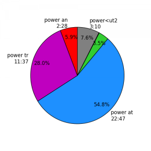
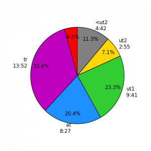
These charts are easily generated by clicking the appropriate buttons on the “Edit Workout” page. These charts are only useful if you have defined your training zones and FTP in the user profile, but they are quite useful if you do. If you are implementing a polarized training plan, you really need to keep track of how much time you spend in different training zones, defined either by the target power or target HR range. These charts give that information. If you are training by HR, you might want to track the Training Impulse (TRIMP) to get an overall idea of the training load that you are managing.
Workout Summary
Down in the right bottom corner is a text summary of the row that divides the whole workout into whatever intervals you defined on the PM at the time you did the row. In this case, it was 2 – 5 km intervals.
Workout Summary - media/20161226-232719-sled_2016-12-17T12-56-28ZEST.strokes.csv
--|Total|-Total-|--Avg--|-Avg-|Avg-|-Avg-|-Max-|-Avg
--|Dist-|-Time--|-Pace--|-Pwr-|SPM-|-HR--|-HR--|-DPS
--|10521|41:30.0|01:58.4|221.8|23.5|158.3|181.0|10.8
W-|09976|38:10.0|01:54.8|233.2|23.4|158.5|181.0|11.2
R-|00548|41:15.0|37:38.5|073.4|24.8|156.6|181.0|00.4

Workout Details
#-|SDist|-Split-|-SPace-|-Pwr-|SPM-|AvgHR|MaxHR|DPS-
00|04984|19:03.6|01:54.7|232.4|23.1|151.2|172.0|11.3
01|04992|19:07.1|01:54.9|234.1|23.7|165.8|181.0|11.0
The summary has totals for work (“W”) and rest (“R”) at the top and provides averages for pace, power (W), rate (SPM), heart rate and Distance Per Stroke (DPS). Down below, is a summary for each of the work intervals. Because the stroke data that the PM provides is not exact, the 5km distances report as slightly shorter in the upload process. For this reason, if you are doing any ranking distances, you should double check the times and distances if you export the workout from rowsandall to the concept2 logbook.
These summaries can provide a great short hand way to track progress over time. Watching your avg pace get faster for the same workout, or you avg HR get lower for a steady state workout is a sure way to see that you are making progress.
This is just starting to scratch the surface about things that you can do with rowsandall. More to come soon.