
We have released a few cool improvements that make the Empower Oarlock force curve chart even more useful. This post explains what’s new and shows you how to use it.
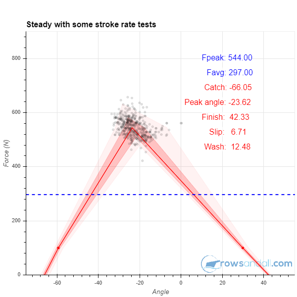
In the recent article “Rowsandall and the EmPower Oarlock – Part 1 – Intervals, Flex Charts and Force Curves“, Greg Smith explains how to use Rowsandall.com to get the maximum value out of your Empower Oarlock data. Being a true beta tester, Greg also privately mailed me a huge list of suggested improvements, which are currently being implemented one by one. But some of his suggestions for the force curve were really great and I moved that task to the top of my priority list. Here’s the result. Force curve on Steroids. Tadaa:
 Or would you rather have it like this?
Or perhaps like this?
Now, while all those variations on a theme look extremely cool (at least they do to me), they are also extremely useful because they provide a lot more information, at a glance. Let me explain, starting with this chart again:
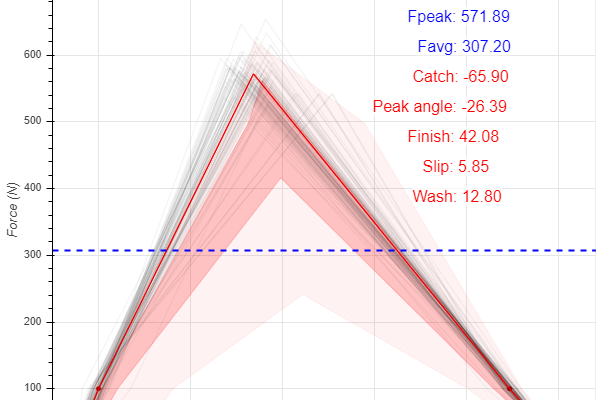
As explained here, the red line connects average (or, rather, median) values for catch angle, slip, peak force, wash and finish angle 1, and you can use sliders to look at different subsets of your workout data (by stroke rate, by work per stroke, or by selecting a distance interval). What’s new?
- To make the angle positions of the “slip” and “wash” a bit clearer, we have added a red dot to show their position. Do you see the red dots?
- The red line now lies on top of confidence areas. The light red area shows you the range where roughly 90% of your strokes are, while the dark red area shows you the range where roughly half of your strokes are 2.
That last feature gives you a lot of information about stroke consistency. The narrower those areas, the more consistent your strokes are. To make it simple, you can say that the light red area contains all your strokes except outliers (paddle strokes, turns, etc) while the dark red area is a good indication of where your “typical” stroke is. Around the top of the force curve, it is interesting to compare the left side of the “triangle” with the right side. You can see in this example that the median peak force angle is -23 degrees, but the distribution is skewed towards the finish. So, while it is true that exactly half of the strokes has a peak force angle below 23 degrees, most of them are pretty close to that value.
Now, while those aggregate values are interesting, if you want to dive a little deeper, there are two ways to show the underlying raw data.
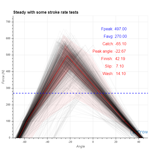
The picture here is what I call “Force Curve Collection” in the little form that allows you to change the look of the force curve chart. It’s basically the same plot as above, but I have added thin gray lines, each representing an individual stroke. This enables you to eyeball the chart and get a good feel for the shapes of different charts. It gives you a much better feel of what type of strokes you are making, i.e. how catch angle variations move around your peak force angle.
Please note that I have included all “rest” strokes in this chart, just to show you more outliers. Normally, I would remove these.
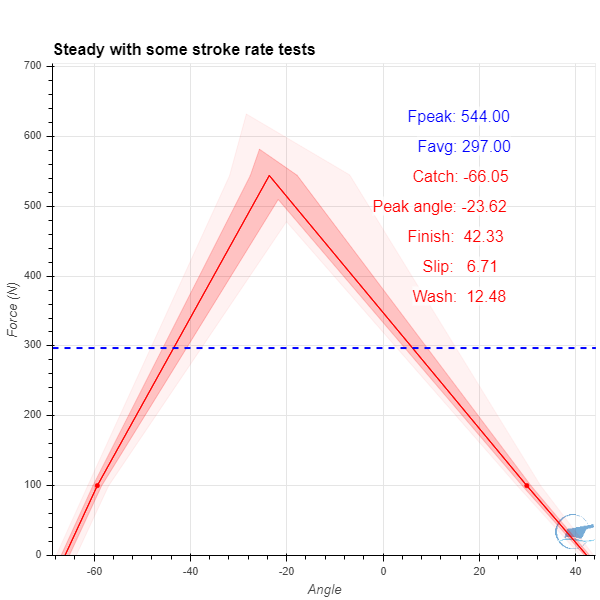
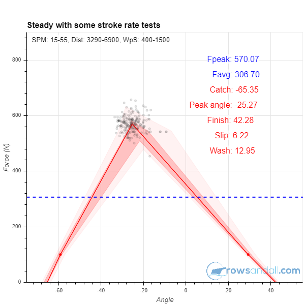
Let’s use the sliders to play with this chart. 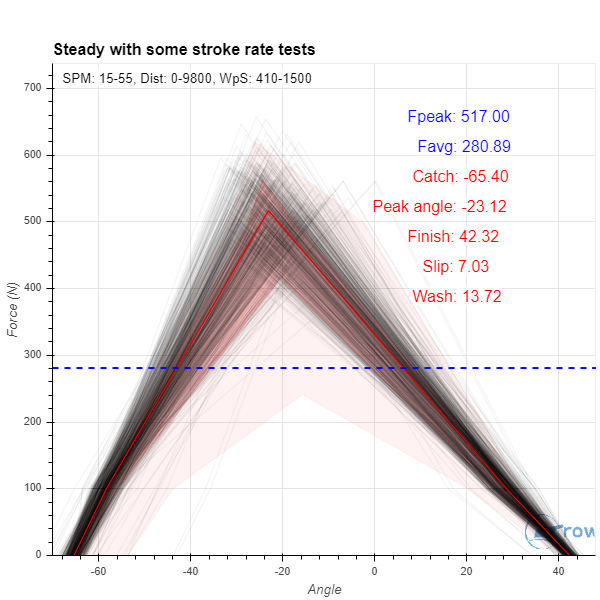 So, while Greg had to revert to browser screenshots in his article, I can show just the plot and still have all the information, because I have newly incorporated a note about the slider settings in the top left. In this case, I remove all strokes with a Work per Stroke below 410 Joule, which basically removes all paddling. You can see how the collection of force curves narrows, especially around the catch (left bottom of the chart) area.
As a side note, while the slider settings affect the collection of gray lines (individual force curves) and the red line (median), the red confidence areas are not changing. They are still reflecting the entire workout. Let’s play with the sliders a bit more:
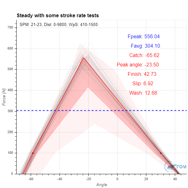
Here I have selected all strokes between 21 and 23 SPM. I am interested in this because in this workout I rowed a few 2 minute sets at 22, 24 and 26 spm, so I want to see how consistent my strokes are in each set and between sets. Here are 24 and 26 spm:
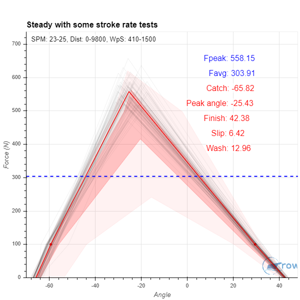

One thing I notice is how the peak angle moves towards the catch as I rate up. Especially at 26 SPM, there seems to be a significant portion of the strokes that are skewed towards the catch. Interestingly peak and average force values, catch angle and finish angle are hardly affected, but the value of slip is decreasing as I rate up. Apparently I am pushing harder in the first part of the stroke, catching water hard, and it is open for debate whether that makes me faster. It may cause boat check which ruins my efficiency. I think that this is a valuable insight.
Here is some more slider setting play. Let’s look, for example at low rate work when I am fresh versus when I am tired:
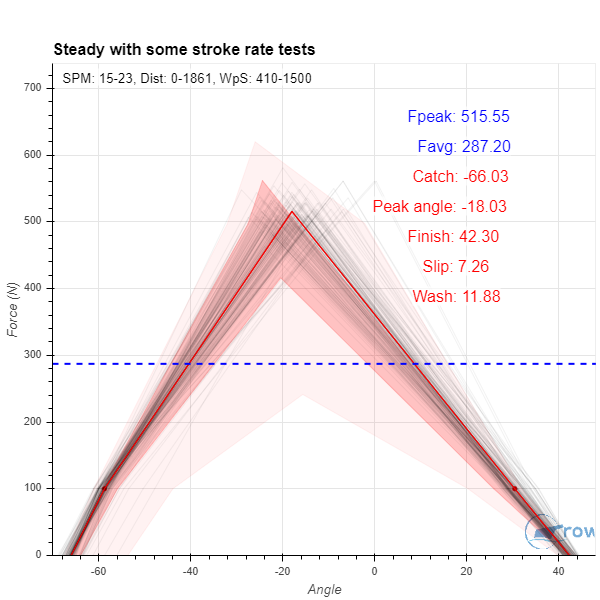

Ouch. There is definitely an effect of fatigue and it looks like it makes the second half of my stroke weaker, moving the peak force angle towards the catch, and affecting Wash values.
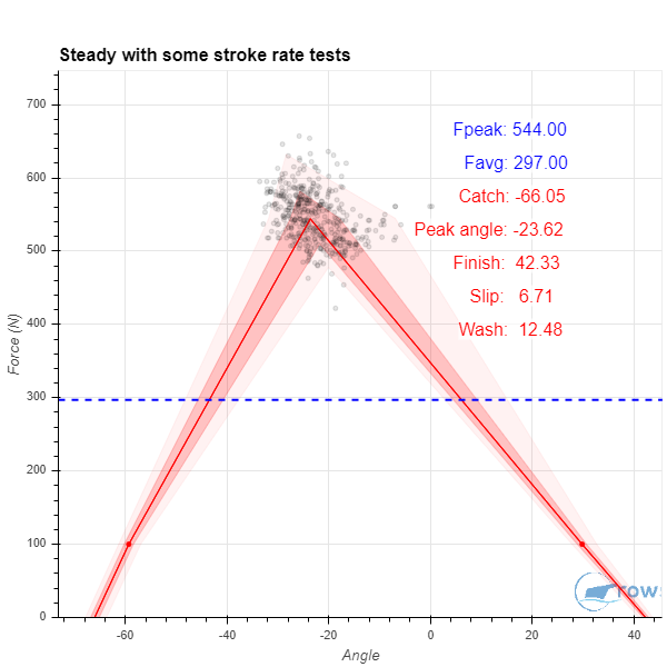
Instead of looking at entire curve, we now also offer the option to only show the peak force position. Like this:
So now the position of your stroke curve peak (angle, force) is shown as a little gray dot. This allows you to see part of the underlying raw data, while still being able to see the red areas well. Playing with the slider setting again, selecting a distance section of the workout:
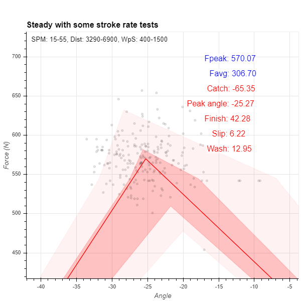
Finally, the chart itself is of course fully interactive, so you can for example zoom in and out without changing the underlying data selection like this:
Do you have an Empower Oarlock? Try out the Force Curve! And, if you are interested in feedback from the experts, post them on the Rowing Data Facebook group. Stroke curves are very individual and we love to look at yours and analyze them. The insights gained can help you row faster.
Finally, if you want to see a video of how the slider settings affect the selected data, click here.
- We are connecting those lines to make the chart easier on the eye, but be aware that, especially around the top of the curve, the actual force profile will look slightly different. Unfortunately, NK Empower doesn’t provide more than five points. ↩
- Geek side node. I am using the word “roughly” because the NK empower data gives you just five points (catch, slip, peak power, wash and finish angle, only one of which has a variable force value. So using proper statistics, I am able to draw a confidence ellipse around the peak force, while providing a confidence range around the four other data points. Connecting those ranges and showing an area is not mathematically or statistically correct. For presentation purposes, however, it really helps giving you a feel for where your curves are. ↩