

This is the second installment of a multipart article describing how you can use rowsandall and the EmPower Oarlock to gain more insight into your rowing.
In the first part of this series, I discussed the parameters that the EmPower Oarlock measures and introduced some of the tools on rowsandall that let you dig into the data from your workout to get insight into your rowing technique and performance
Having the ability to easily analyze the data from a rowing session is great, but to get insight into you training, it’s helpful to be able to use the data from a whole set of workouts. Maybe you want to check if you are making progress over a season, understand how rigging changes impact your performance, or even just to look a specific measurement over lot of strokes in a bunch of workouts to see how consistent you are. Without rowsandall, it is incredibly hard to do this kind of analysis.
How does rowsandall help? Well, first, it provides a common destination for all your rowing data. You can easily get your workouts from the speedcoach to rowsandall from the NK Link (or NK Logbook) app on your smartphone or PC. And once the workout is there, you have all of your strokes in a database, stored in a way that lets you analyze multiple workouts at the same time.
Am I getting better?
Many rowers use training plans that progress through a set of workouts over a number of weeks, and then repeat the cycle. I’m one of them. My typical training plan is a mutant hybrid of the Wolverine Plan and the Pete Plan. I typically do three hard workouts a week, one short intervals, one long intervals, and one hard distance piece. I usually program three or four different sessions into each slot, so I can compare my performance roughly on a monthly cadence.
For example, last fall, one of my “go to” long interval sessions was 5 x 1500/5′.
I did it early September and then twice in early October. Here are the summary charts.
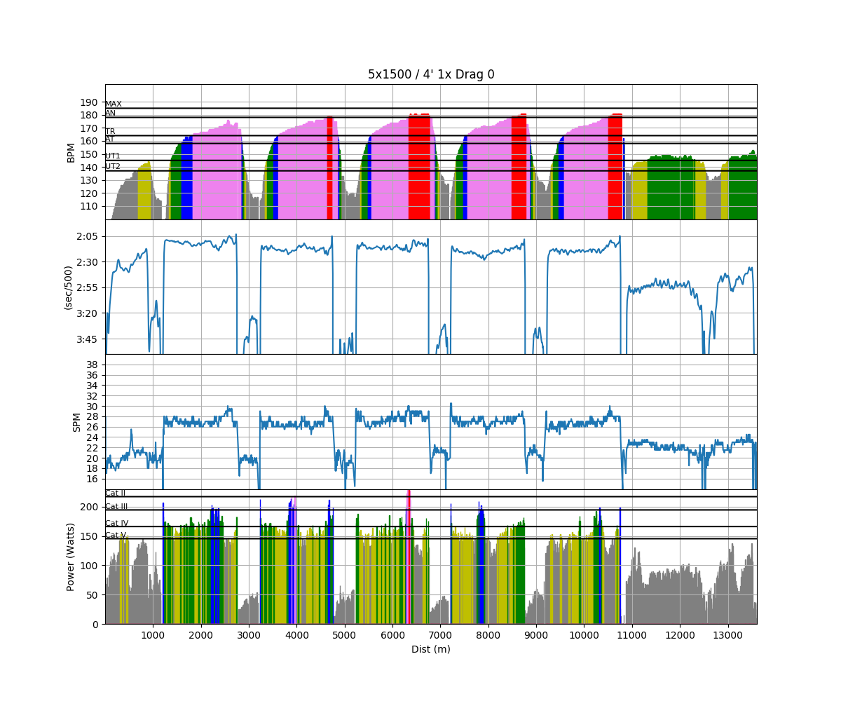
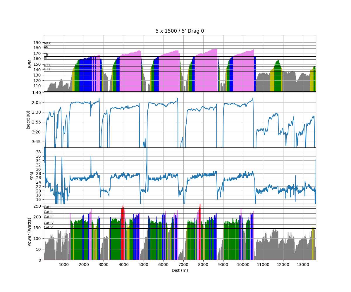
Looking at these charts, it looks like the heart rate is higher in the first one. I wonder whether I was just working harder and going faster, or if I was actually doing better a month later.
Rowsandall has a graphical tool to help out with these kinds of questions. It’s called “Compare Workouts”. It lets you pick a bunch of workouts, and plot out a single parameter from each one.
So, let’s start with heart rate. I just select the three workouts, I want, choose to plot HR versus Time, and I get this.
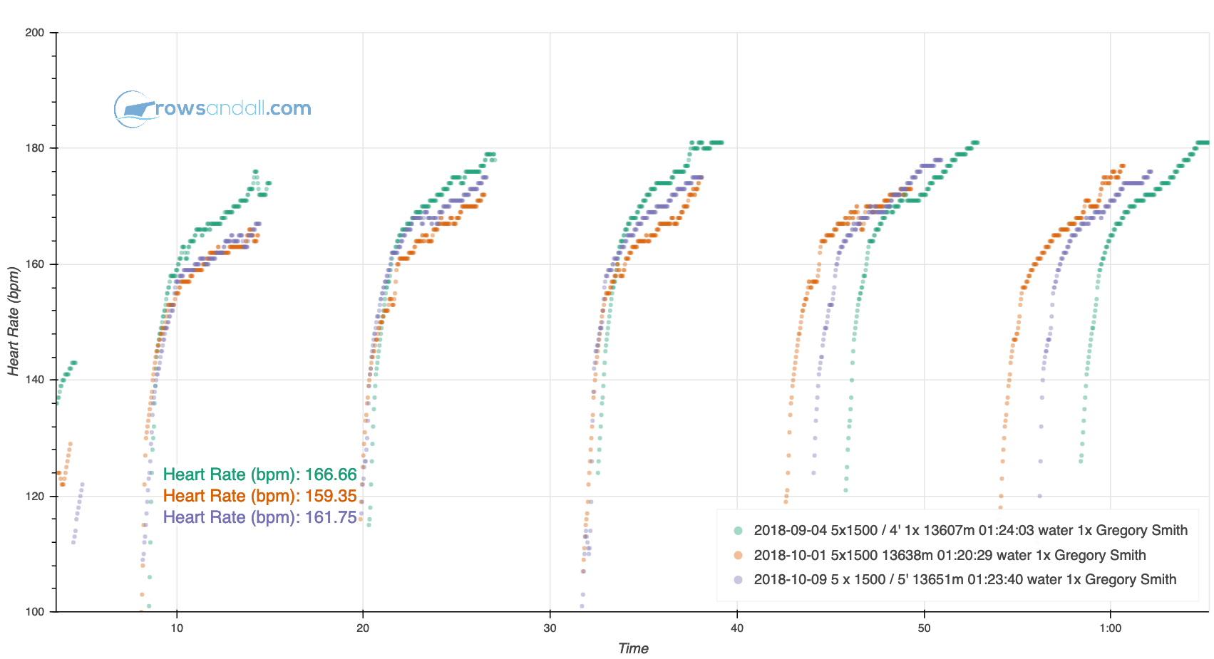
The plot shows the three workouts and it is just showing the “work” strokes, because I used the interval editor to pick out the intervals. The x-axis is time, and the y-axis is heart rate. The three different workouts are shown as different colors. The first one, from September is green, the October 1st in orange, and October 9th in violet.
My average HR was higher in the first workout. You can also see some of the realities of OTW training. I ended up with slightly longer or shorter rests to get myself turned around and positioned for the next rep.
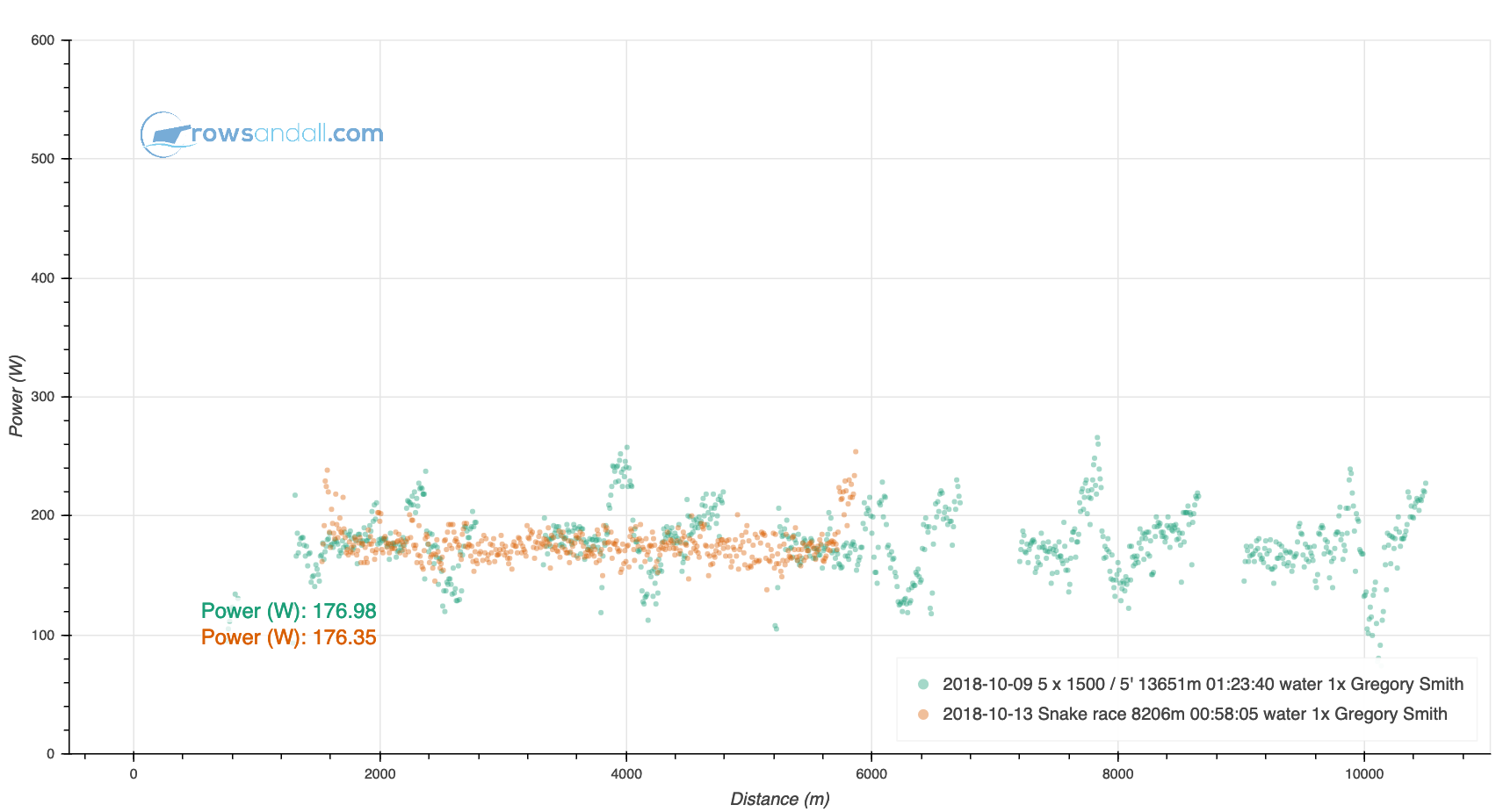
Now let’s use the same tool to compare power.
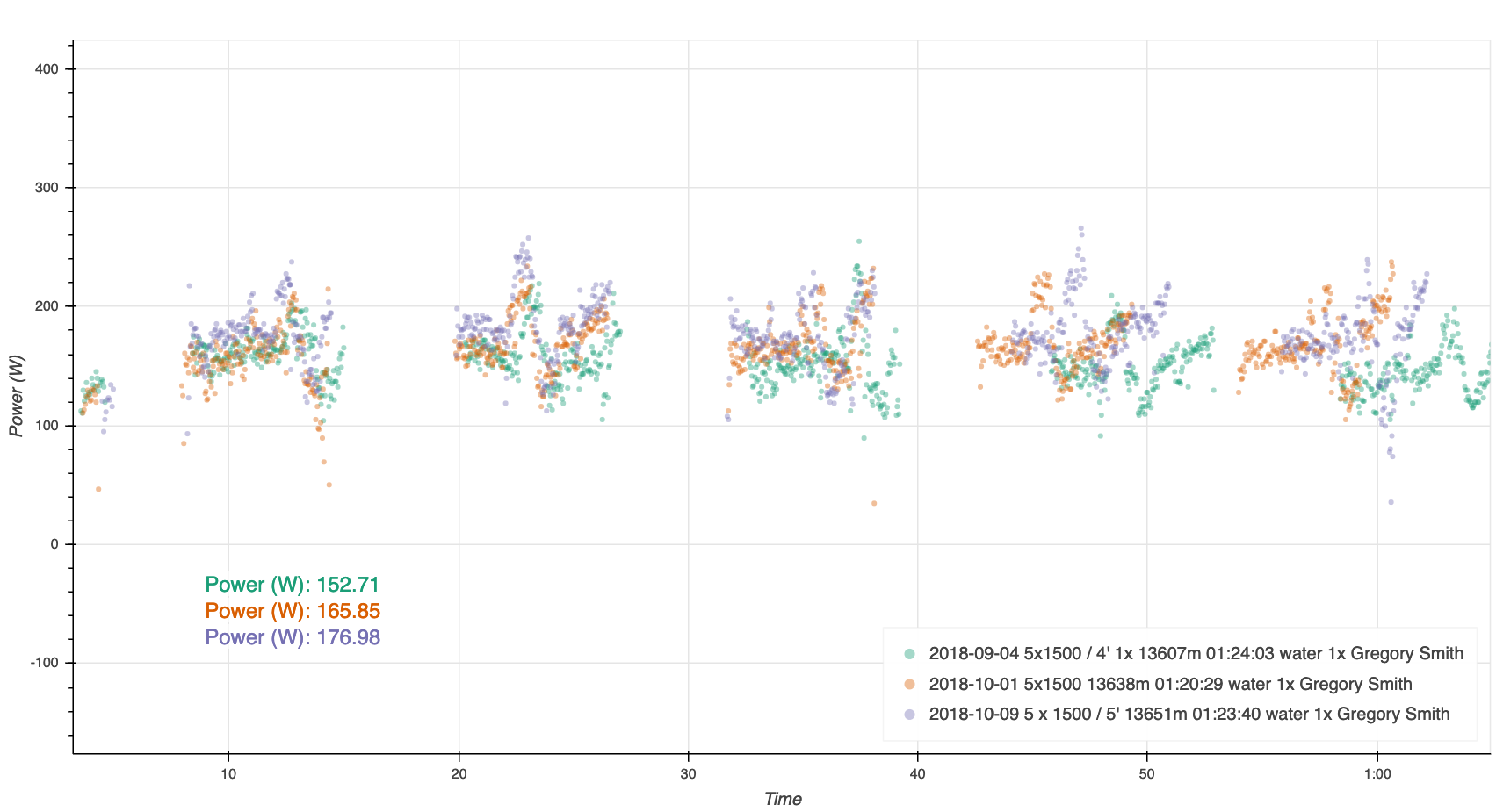
The power data is pretty noisy, but the averages show a good story. My power increased 24W from September to October. Getting more watts with a lower heart rate is great news. Either through improved fitness or improved technique (or both), I was able to deliver more power. Let’s see if there were technical changes over the period. First, effective length.
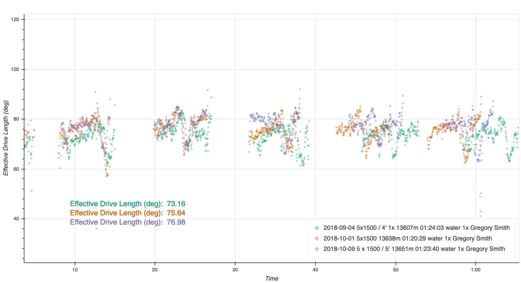
I’m happy to see about a 4 degree improvement on effective length.
This brings up a question in my mind. Is the higher power just from rowing through a longer arc, or is there a change in my peak force too? That’s easy to check.
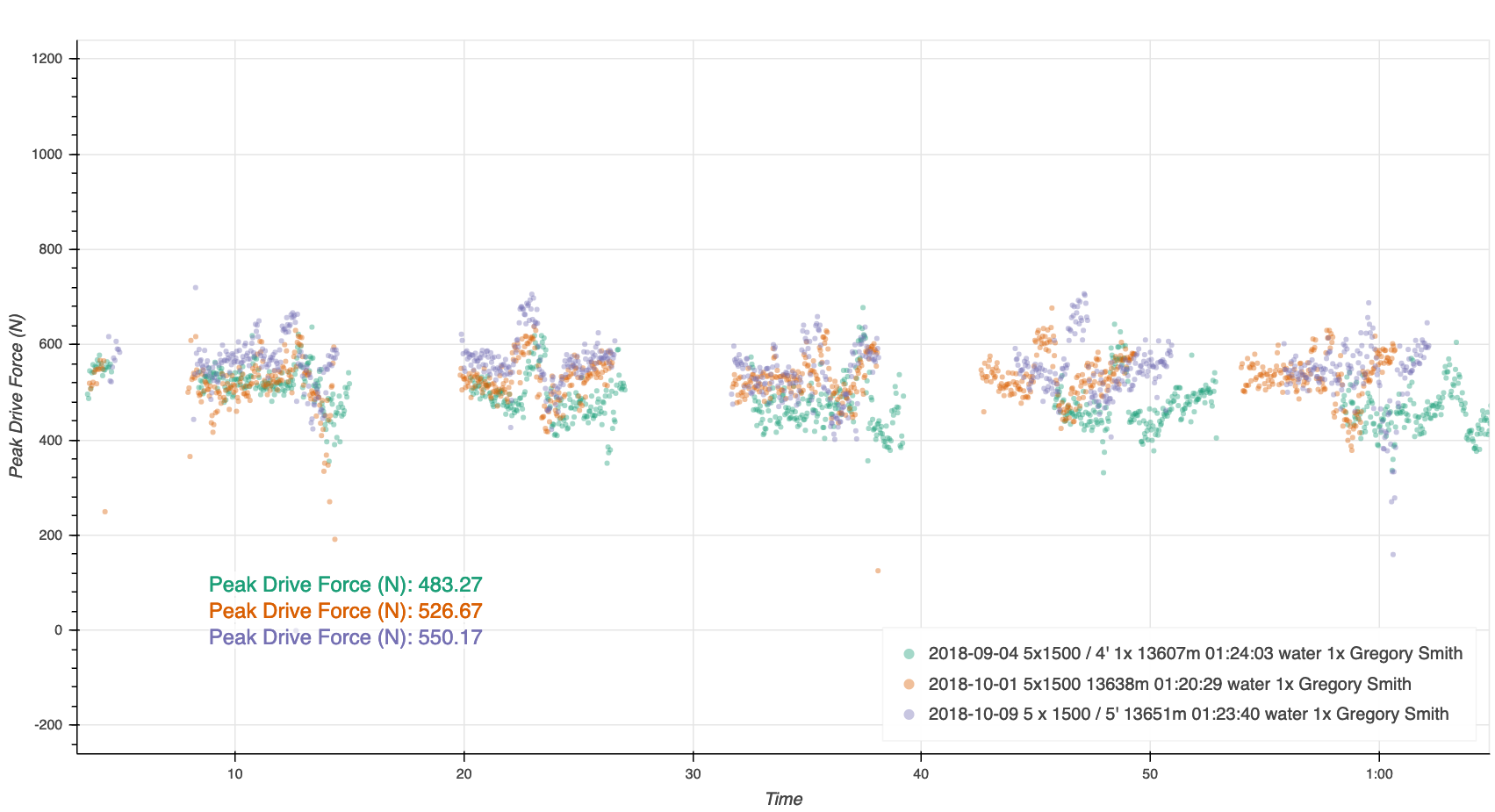
Wow. Nearly 70N higher in the last workout than the first. So, I was rowing longer and achieving higher peak force in the stroke.
You don’t have to compare the same workouts either. I can also compare how I did in that great interval workout with how I did in a head race a couple of weeks later. Both of them were in the same stroke rate range and with roughly the same target power. Let’s see if I was able to maintain the technical improvements between those two sessions.

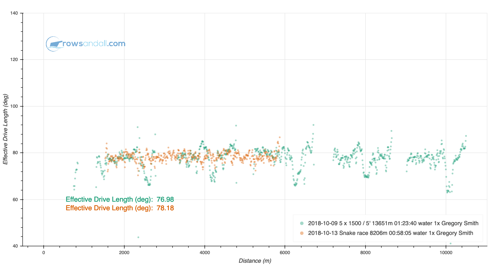
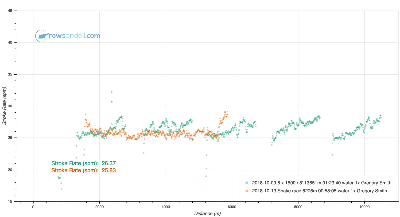
I think I was pretty consistent between training and racing.
How Fast Can I rate?
Since every stroke of every workout that you upload to rowsandall is stored in a common database, it is possible to use that data to answer questions about trends. Since the analysis that I did on the 3′ interval workout showed an interesting relationship between stroke rate and my technique, I wanted to answer the general question. What is the rate where my technique starts to fall apart.
Using a tool on rowsandall called “Trend Flex Chart”, I can pick a bunch of workouts and plot the data. For this, I wanted to pick a broad range of workouts from last OTW season because I wasn’t sure which ones had what stroke rates. Then I just grouped the data by stroke rate and viola.

I have to say I was surprised by the analysis, especially the plateau from 23 to 25 spm. I was also happy to see good power increase all the way up to 29 spm. It looks like that is about the limit of my abilities.
Just for fun, I did a comparison to the prior season. I had troubles with injuries in the prior season and I expected it to be worse.

Look at the decline above 27 spm!
Looking at progress over time
The whole point is to get better at rowing. Rowsandall gives you a tool that can help you make sense of the changes that you are working one over weeks and months: boxplots. For those of you unfamiliar with box plots, you might want to check out the description of them on wikipedia
On rowsandall, I can use boxplot to look at my effective length over the whole of last season.
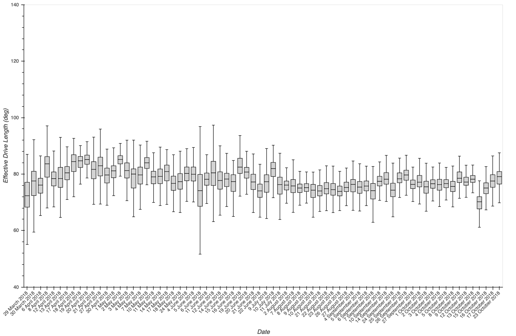
So, what’s going on here? The x-axis is date, and the y-axis is the parameter that you are analyzing. Each workout is represented by a box. The line in the middle of the box is the mean value for the workout, the vertical size of the box is the range of normally distributed data (about 80% of the data values fall in this range). and the little whiskers extend out to the minimum and maximum values.
So the plot conveys a lot of information. You can see a change in the July timeframe. That’s when my coach gave me some feedback to adjust my footplate a bit to the bow and shorten my inboard to give me a bit more room at the finish. She also asked me to be more careful about avoiding too much layback at the release. You can see my stroke shortened a bit, but became much more consistent (the boxes are smaller vertically).
Here’s another parameter from last season, my Work per Stroke (WpS). This is a measure of how consistent your stroke is across different rates. If it goes up, that means that you are consistently putting more oomph into each stroke.
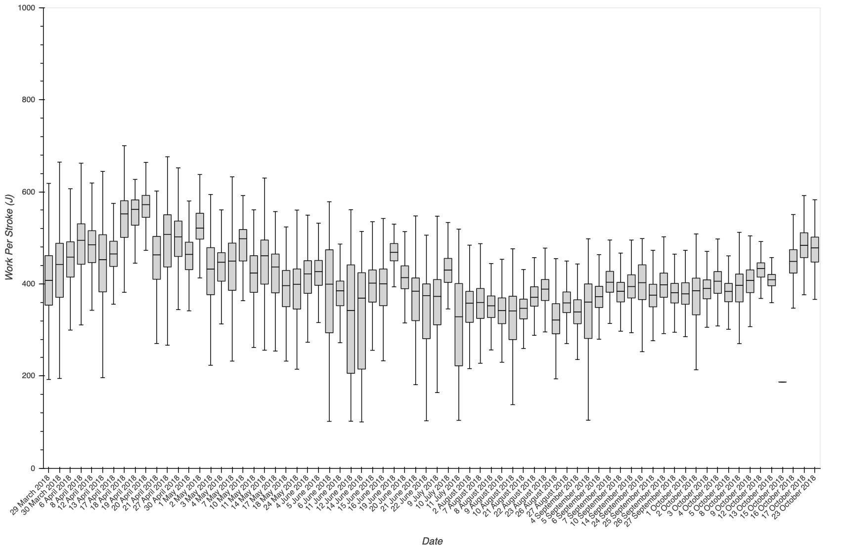
In this you can see that I came into the OTW season in pretty good shape and improved over the first month or so. Then I had a period of time where my training was interrupted by a lot of travel and work stress and things got worse. You can see the rigging change resulted in a more consistent WpS value after the beginning of August, and from there to the end of the season, I had a great run improving my WpS as I was training consistently and highly motivated for head racing season.
In the next installment we’ll look at using EmPower and Rowsandall to bring one of the most “powerful” training methodologies from cycling onto the water.