This post contains the notes that I used for my talk of the same title at the Rowers conference 2019. I would like to thank Greg Smith and Mike McGuirk for their help preparing for this presentation.
Turning Rowing data into Performance Improvement
Let me start with a question.
We are all familiar with rowing to data. For decades we have been putting devices in boats to measure the stroke rate.
Only recently have we obtained the opportunity to put many more quantities in front of the rower.
Suppose you could give a rower only one additional quantity live in the boat during training/racing. Which one would you choose?
- Boat Speed?
- Heart Rate?
- Power (in Watts)?
- Any other quantity?
And if forced to remove one of the two, which one do you remove? Stroke Rate? Or the other quantity?
My name is Sander Roosendaal. I learned to row in 1984, in the Netherlands where I grew up. I have enjoyed the sport ever since and I am currently competing as a Masters rower. I did a Ph.D. in Experimental Physics in Utrecht. Currently I live and work in the Czech Republic, where I manage a large Research group at a global corporation active in the Aerospace industry. As I have always been attracted to numbers and physics and performance models, I have been playing with rowing data since the beginning. Two years ago I have started building a web platform for rowing data at rowsandall.com
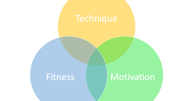
This talk is about improving performance. I am going to break down performance into three components.
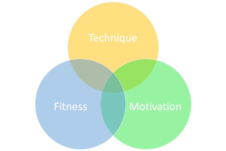
Rowing performance is the sum of good technique, excellent fitness and being motivated.
Fitness and motivation is not enough. If you don’t master technique, you won’t perform well. If you’re trying to win races by being motivated and rowing beautifully, you will probably lose the race after about one minute. If you’re fit and master technique, but you lack motivation, you probably will not even show up at the start.
Rowing data are exciting, but to turn rowing data into a platform for performance improvement, the data platform needs to address all three aspects. It must enable you to record and monitor improvements in fitness and technique, and it must provide motivation through being able to monitor your progress towards long-term and short-term goals, and by offering incentives to keep training and competition.
In this talk, I will start with an example of how I used data to remote coach a Masters rower. In the middle part of the talk I will focus on how data can help you improve your rowing at race pace. In the last part of the talk, I will come back to the requirements that the ideal rowing data platform has to fulfill.
The first part of this presentation is a case study on rowing data and remote coaching.
Remote coaching is coaching without any real time face to face interaction. As a coach, I am limited to the occasional Skype call. I don’t get to see him racing or training.
A big aspect of coaching is the art of making decisions under uncertain conditions. Rowing data can give you a bit more information to base your decisions on, and move you away from guesswork, supporting your intuition with facts. It gives you a way to find supporting evidence for your ideas.
When the athlete is away and you don’t have any direct interactions, you would be blind without access to some data.
This particular case is about a Masters rower with a busy professional live. As many Masters rowers, he was held back by lack of time, lack of a proper training plan and lack of coaching. So remote coaching would be a real help here.
Some more details about the athlete. He was a 65 year old male living in the North East of the US. In the past, he has rowed and raced. At club level after college. Used to rowing stroke seat and has also competed in coastal rowing. He owns two boats, both of which are equipped with an NK Empower oarlock for power measurements. Before he started being remote coached, he had been training himself for a few month, with the help of on-line available training plans.
With this “fresh” athlete I started as any remote coach would do. A skype interview to chat about a realistic training volume and frequency. Given those, find a realistic training goal. This was followed by some initial fitness testing on the ergometer.
In terms of 2k result, he was in the 65 percentile range. On a 5k test, he had issues with pacing.
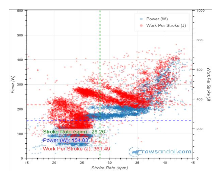
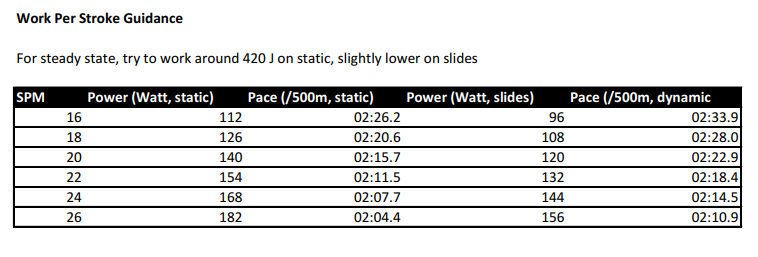
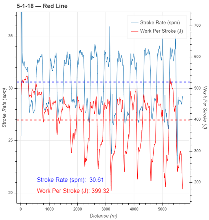
I also had an additional benefit. This guy had already been using Rowsandall for self coaching, so I had a few months of on-the-water and ergometer rowing to explore. One of the things that struck me was an apparent lack of consistency in “work per stroke” (amount of “umph” you put in each stroke) across the stroke rate scale. See the huge range of WPS for higher stroke rates? Ideally WPS should be relatively flat with a slight downward trend as rates go up. So initially we set out to work on that, and on drive length, which I found short given he is a big guy.
With that observation, I developed some initial guidance on which power levels to hold on the ergometer, basically to force him to stroke consistency.
Just a quick run through the data flow. For boat training, we used the NK SpeedCoach GPS and Empower Oarlock. Data was synced to NK LiNK through Bluetooth, and from there is easy to export to Rowsandall.
 On the ergometer there are a few apps available. We settled on Painsled. In contrast to the familiar ErgData it is able to record Drive Length. Also, Painsled exports directly to Rowsandall without having to use the Concept2 logbook. Cross training sessions were imported from Strava where they arrived from a Garmin or Polar fitness watch. I will expand on the analysis and feedback part on the next slide.
Based on the interview and testing, I developed an overall plan for the season, setting intermediate targets for each month.
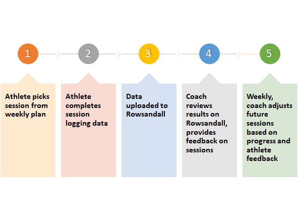 Then, each Sunday evening, I would communicate the sessions for the next week, and then we would follow the simple process outlined here. On a daily basis, I would review a little summary table for the athlete as shown here, where the colored circles allow you to quickly spot sessions that require attention. If you are taking care of a group of rowers on the same plan, you could have a column of colored dots for each rower.
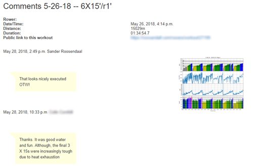 The picture shows how I could send a simple comment to a specific workout, inviting the athlete to give some more context information.
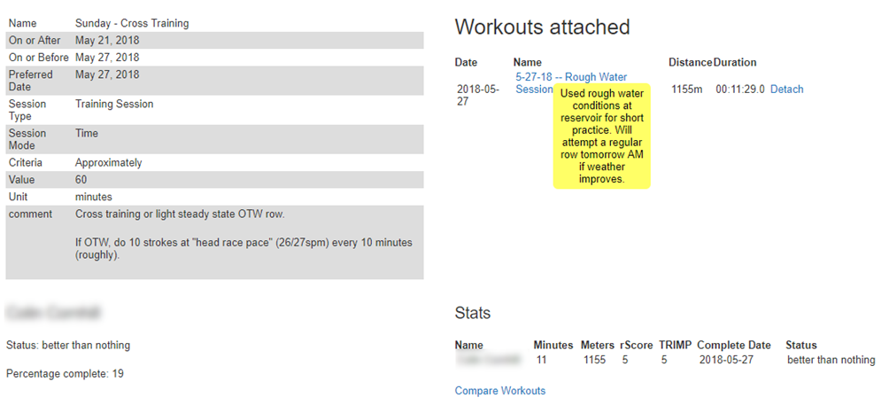
The data platform allows you to zoom in on a single session to get all the details and have the athlete’s session notes in a popup box. This session was planned for an hour, but the athlete had to get off the water quick for safety reasons.
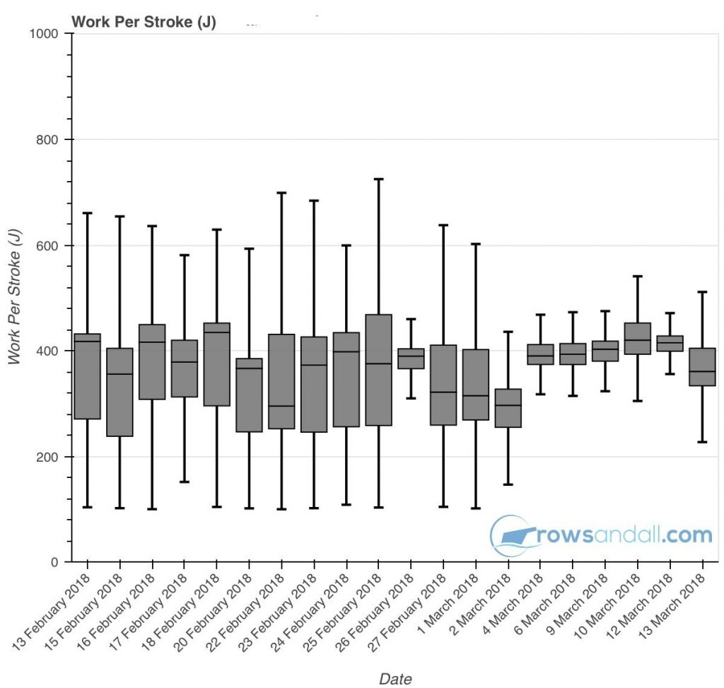
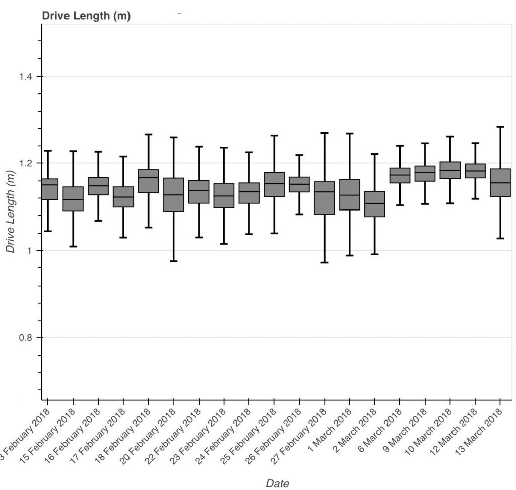
Remember we were focusing on Work per Stroke and Drive Length. This box chart gives Work per Stroke and Drive Length per session. The horizontal line gives you the session average. The boxes indicate the spread of strokes, with the whiskers indicating outliers.
The data platform can give you this information for any quantity that you are interested in, for any range of dates, with a few mouse clicks.
In this case, I can immediately see confirmation that the athlete is working on the main targets. Work per Stroke is more controlled in a narrow range, and the drive length average has slightly increased and is more constant from session to session.
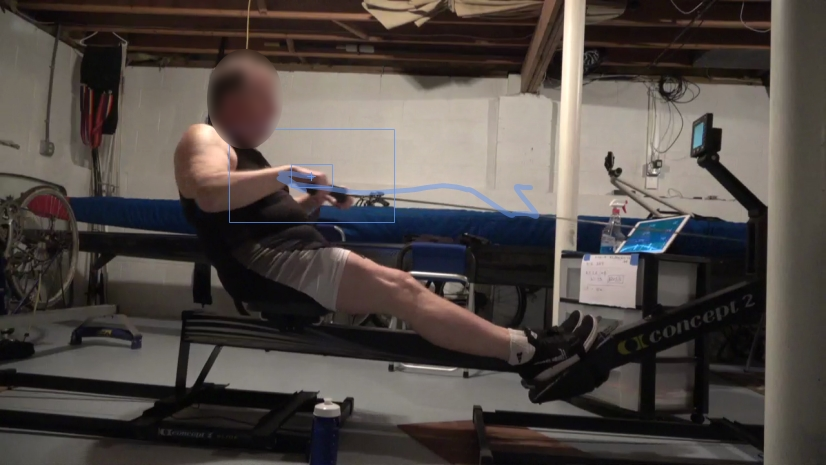

Using just a phone, I asked the athlete to take avideo of him rowing at firm pressure and race rate.
I used Kinovea, a tool you can download for free to track movement of body parts and other objects and annotate the video and give feedback.
For real time coaching, a good phone app is Technique. You can shoot a few strokes, annotate the video in a minute and immediately share with the rower.
This video gave me some ideas on the root causes of some of his stroke metric values. We decide to work on posture, and also to increase the emphasis on core strength workouts.
This is an example of a problematic session. The idea was to alternate >6k pace and <6k pace but hold constant Work per Stroke (quality strokes). A couple of things went different than anticipated. First, the athlete had not understood the goal of the session and made the pace differences too big. He also started out way too fast, so the “slow” intervals quickly became rest intervals.
Especially in remote coaching, it’s important to spot sessions where the instructions weren’t clear and the athlete executed something different than anticipated.
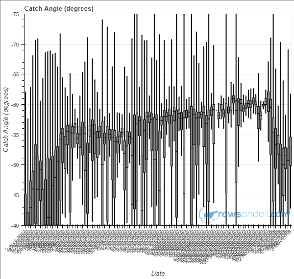
Reviewing practice data, I noticed another area that could potentially help my athlete get faster. For a guy that is 2m tall, I would have expected him to be able to row longer. I thought he could increase the catch angle that he was using. By using the catch angle feedback from Empower in the boat, he could set a target and work towards it. By using another box chart, as a coach I could see the progress he was making.
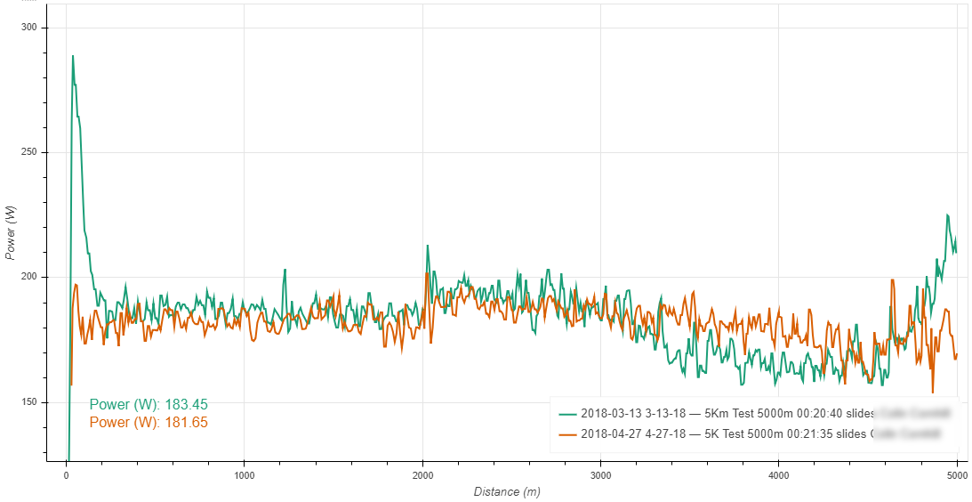
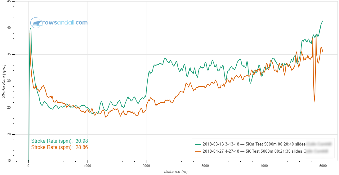
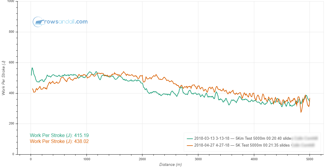

But it can also be very powerful to just compare two 5K tests, executed at the beginning of the program and after a few weeks. At a first glance, the test is disappointing. Five weeks into the program, the athlete has become slower. On the other hand, his power is more evenly distributed over the test, perhaps aided a bit by a slightly conservative approach to the test.
You can see that very clearly in the stroke rate. Perhaps he was a bit too conservative in the second 1000m, but instead of a panic rate increase in March, in April he increased stroke rate in a very controlled way.
Work per Stroke was also more constant. See how in March he dropped significantly when rating up. That was really a panic move.
Drive length was exemplary in May, compared to a shortening in April.
A final remark about this test. We saw areas of improvement, but we were also disappointed that the time was not faster. I had a good Skype call with the athlete, which helped us find out that he was struggling with the training volume. We decided to drop one weekly session to enable better recovery between sessions.
So let’s see how the athlete perceived rowing with data. Here’s a screenshot from an email.
Before using data, it was too easy to dismiss the coach’s input as ‘just their opinion’.
With data, it would have been hard to disregard the input when you see your own data and have the reference sources for comparison (even so I did try occasionally to deny 🙂 )
With data, there was nowhere to hide. You cannot get off the water and make up some subjective but plausible-sounding story about the session.
The data all correlates.
If you were rowing short, it shows in multiple places.
If you were letting the Work per Stroke drop on your final intervals, there it is for all to see
On every stroke, I was conscious that the coach could see me.
So in conclusion, using an online data platform enables you to
- Communicate the Training Plan and monitor its execution in one central place
- Look at every stroke in every session (even if you’re on the other side of the Atlantic)
- Ask for specific video to diagnose technique issues and make recommendations
- Monitor fitness and technique progress (or lack thereof) as the season progresses
- Reduce the amount of time a coach spends fiddling with spreadsheets and enable them to focus on what the data tell him about performance
Critical Power Concept
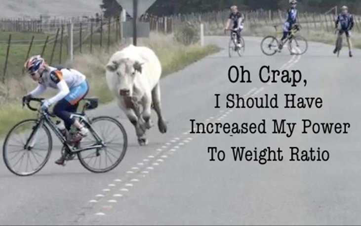
What analytical tool should the cyclist use to outrun the charging bull?
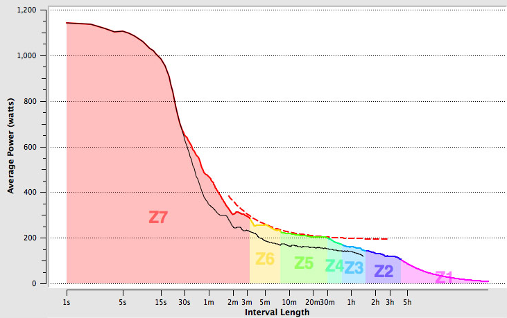
Correct, it’s the Critical Power Chart. This tool is heavily used in cycling. It plots time to exhaustion at different power levels.
In the example of the charging bull, the rider would probably use the Z7 power zone. At 1,000W, he would sustain for 15 seconds. At 600W, he would be able to extend that to about one minute.
In cycling, this tool is used to:
- Prescribe an appropriate power output for a new interval session
- Use shorter tests to predict the maximum sustainable power for longer efforts
- Analyse changes in a rider’s fitness over time
- Compare riders’ performances
- Identify strengths, weaknesses and areas for improvement
- Predict the effect of changes in performance at one time duration, relative to another
- Prescribe power training zones
The CP chart is able to reveal whether you are a sprinter or a stayer, based on objective criteria. Almost a year ago we spent significant effort to analyze the online available ergometer data to set standard across gender, age and weight groups.
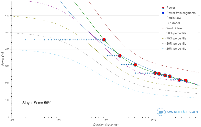
As a result, we can tell you where you stand in terms of absolute power at different distances, but also tell you whether your data suggest you’re a Kenyan or a Jamaican. So this guy is not really world class but he is better than 90% of his age group. From his stayer score he looks to be an allrounder.
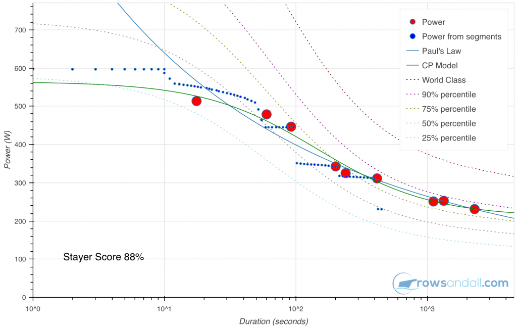
This is the same guy a year later. He has taken on some weight, so we are now comparing him to the heavies. He has also recorded a rather disappointing 100m effort, classifying him as a stayer.
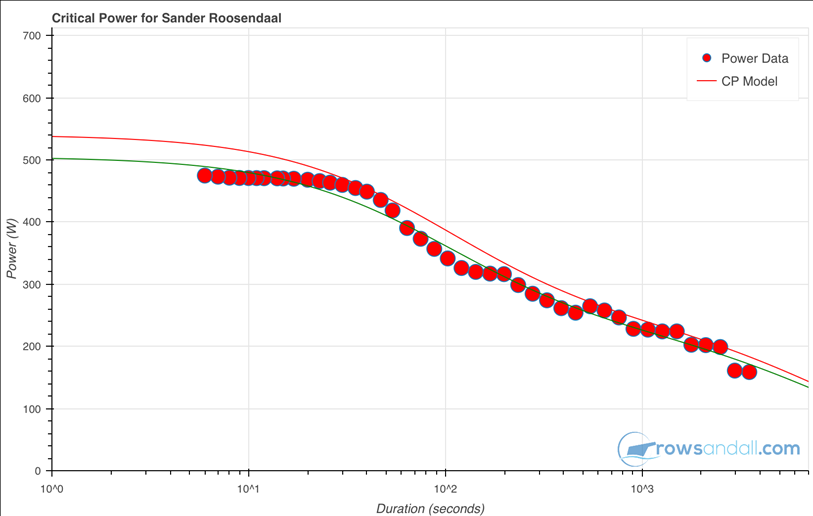
When you have a power meter in the boat, you can also measure your critical power on the water. We had to adapt the way we constructed the data set a little bit, because on the water, boat speed can be significantly influenced by the wind.
Instead of relying on test pieces we added the automatic finding of fast “pieces” in any row. By definition, this also introduces some data points at sub maximum effort. Therefore, we did an additional algorithmic improvement to move the green curve up to the red one. You can safely say that predicted performance is between the red and green curve.
Here is how you can use power to “derive” a optimal race pace.
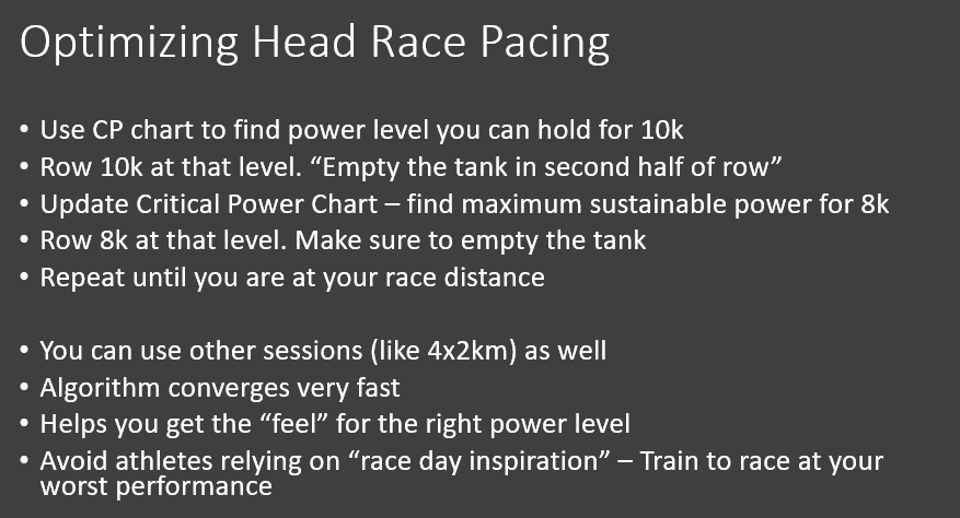
This approach really counts on having power data available in the boat and on having a data platform to quickly determine averages. It replaces the stopwatch and is insensitive to wind and other external influences.
Basically, you start with a guessed power level that you can hold for a distance that is longer than the race distance. It’s good to start at a longer than the race distance. It’s less intimidating for the athlete than a test at the race distance. In the next slide I will give you an example.
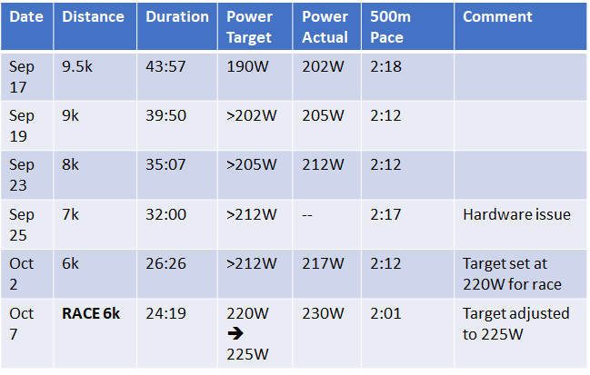
So here is a 2017 season preparation for a head race over 6k. The sequence started with a 9.5k hard distance trial. Look how we shorten the trial distance gradually and increase the power target. Again, you need to have access to a power number in the boat.
Do also take a look at the pace column. You can see that sometimes the pace does not correlate with the power. Pace depends on external factors like wind and choppy water.
On September 25th, there were hardware issues preventing the measurement of power. In a sense, this was a good test to see if the “feel” for power was there. The pace value was influenced by a very stiff headwind in the second half of that row.
Eventually, we came to the conclusion that 220W would be a good target for the race. The race was held on a river about 70km from our boat house. Arriving there on race day, we noticed a pretty strong tail current and nice flat water. This race would perhaps be a minute shorter than anticipated. On the spot, accessing the data online through the cellphone, we decided to add 5W to the power target. Eventually, a strong sprint in the final 1k got the average power up to 230W. The race was won.
Data to Performance Framework
So in the previous two parts I have given you examples on how having data available make certain tasks very easy for a coach. Here are a couple of the jobs a coach has to do, which can be enhanced by a data platform:
- Above all, a coach needs to motivate his rowers. Empower them to discover their true potential. Ask questions. Set targets, show them how they are progressing towards them. Enable friendly competition. Help them grow as athletes and as persons.
- He needs to work on technique. Be able to identify what is slowing the boat down. Translate that into something the rower can work on, a metric he can monitor.
- He needs to plan for the athletes to be ready on race day. Make plan for the season, the month, the week and the session. He needs to communicate that plan. Execute it. Monitor execution. Make changes.
On top of that a coach needs to be a leader, look at the big picture. See the trends. Make timely decisions.
Finally, there is an management aspect which cannot be neglected. A coach must manage communication, crews, training resources, races, and more. I am sure you are aware of jobs that I have forgotten.

When we focus on performance, and look not at the “what” but at the “how”, it is clear that we go through the famous improvement cycle:
- Plan
- Execute
- Measure
- Adjust
- Repeat
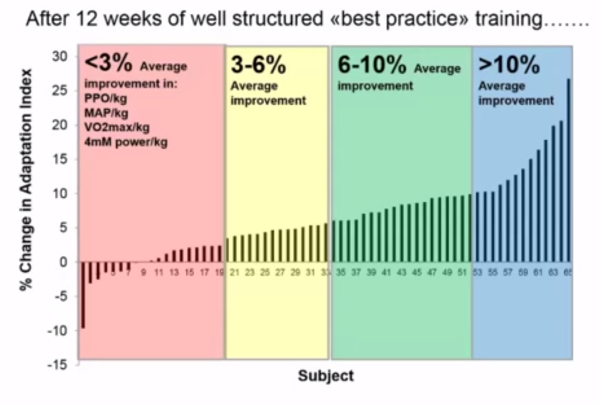
There is a very important point that I want to make here. One size doesn’t fit all. Here’s a chart from a publication by Stephen Seiler. He measured the progress of more than 60 athletes who were given a “best practice” training program … and found that almost half of them made only average improvements or worse.
You need to look at how the individual is progressing, and data can help you. You also need to keep varying your approach and discover what works with the individual and what doesn’t. Basically you need to constantly monitor. Wouldn’t it be great if the data platform can assist you with that?
Actually, some of the variation needs to be planned for, so that when you need to make a decision you have some data to look at. This is especially true in the preparation phase and in the early part of the season.
Of course, once you are in the main season, the room for experimentation is fairly limited.
So what kind of variation am I talking about? For example, mixing in some short intervals sessions in your training plan, or decide to change the amount of weights trainings. You may temporarily decrease an athlete’s performance on the mid distances, but it may eventually lead to an improvement.
So I am making the case to keep changing things and see if they work. The data platform gives you a way to compare the effectiveness of the different approaches.
The lesson here is that already in the Plan phase you need to plan for some variation, so that your data are diverse enough to start seeing trends. This is important especially in the pre season. Of course, once you are in the main season, the room for experimentation is fairly limited.
So what kind of variation am I talking about? For example, mixing in some short intervals sessions in your training plan, or decide to change the amount of weights trainings. You may temporarily decrease an athlete’s performance on the mid distances, but it may eventually lead to an improvement.
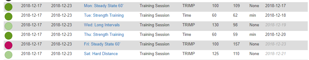 Here is a very simple example of how a data system can help you detect deviations from the plan. It is just so much easier to look at a dashboard with color coded plan vs actual data. You can immediately spot which session you need to take a more detailed look at. Which one is it in this picture?
The ideal data platform enables you to do such things not only for training load, but also for things like drive length, work per stroke, and other quantities that we have seen in the examples.
So in summary, this is what the ideal data platform enables us to do:
- Measure individual’s data during training and racing
- Use the data to discover development needs and work on them
- Do controlled experiments to make sure you are not stuck in a local optimum
- Use the data as an additional entry point for athlete/coach discussions
- Make better decisions faster based on incomplete and small data sets
From all that we can “derive” the requirements for the ideal rowing data platform:
- Reliable and Easy workflow for athletes and coach
- Gives quick overview of progress vs plan for key quantities
- Help coach to detect deviations
- Allows to
- Explore
- Analyze
- Dig Deeper
- Access the raw data
- Provides insights
- Helps you to ask the right questions
- Enables you to experiment and find the global optimum
- Integrates with video data
- Keeps data secure, gives you full control over the data and who has access
- Supports a variety of apps, data frameworks (Strava, TrainingPeaks), and devices
- Helps with Administrative Tasks
- Easy look up of historical data
On top of all that, the ideal data platform is easy to use and reliable. This is a really important point.
At this point in time, I am not aware of any rowing data platform that hits all these bullets. There are various solutions out there. As I do have a conflict of interest, I will not compare them or tell you which one is the best. But one point of advice is to write down what are the top requirements for your club and then compare.
Conclusion
So in this talk I have given two examples of how rowing data can be used to improve performance. How new technologies can be used to improve boat speed. In the first story, I showed how data can make remote coaching more effective to achieve objectives. In the second story, I showed how measurement of power and oar angles can be used to fine tune technique, rigging and pacing to optimize race performance. At the end I showed you a summary of what the ideal rowing data platform should be doing.
Now back to the question I asked you at the beginning. Think again of your case, your athlete. After having listened to my stories, do you want to change your decision? If so, why? If not, do you have more confidence in your decision?
Finally, another job of the coach is to make sure that rowers find the joy and beauty in the sport. Metrics are tools that can be used to help get more joy out of the sport, eliminate bad coaching decisions and reduce frustration. Metrics can help us all row faster and more beautifully.