
Once a wise man pondered:
“What is it my soul is longing for?”
To his surprise his soul responded:
“More silly rowing data charts, baby!”
There you go. At rowsandall.com we are proud of being the laboratory of rowing data charts and analytics. We may not be the slickest site, but we can say without exaggeration that no other site innovates this fast and in terms of charts and analysis we are the world leaders.
The reason is that our site is developed by rowing data enthusiasts. We are in it for the discovery of how rowing data can help us row faster. Our souls are longing for more charts, baby!
So when a bunch of rowsandall.com beta testers and power users were discussing what makes us fast (or rather, less slow), and one of them showed some stuff he had done in excel, the idea for s new chart was born. We didn’t know if it would be a useful chart, but the only way to find out is to implement it and start using it.
That is how the “Trend Flex” chart was born.
You already know our ‘stroke analysis’ chart, where you can plot all your strokes over a given date range. Looking at pace vs power I used it to produce this:

This is each and every on-the-water stroke for the past three months. In various boat types, in varying weather, in varying types of workouts. What we were missing is a way to select only certain workouts and look at average values.
Another characteristic of rowsandall.com is that we release our innovations early, make them available for the community to play with, discover bugs, and give feedback. We use the feedback to improve. So what I am showing in this blog post is really a work in progress, and it is going to improve over the next few weeks.
The new chart is accessible for our Pro users (only 15 € per year and you are a Pro user) and can be found under ‘Analysis’ on the top menu:

In fact, our site is so dynamic that this picture still shows the original name ‘multi flex’. When you click on the button, you grt to the following page:

Our Pro users know the drill. On the left you select the workouts you want to study, while on the right you set the initial chart settings, which you can always change later. On the top there is a date range selector and a search box which you can use to wuickly find the relevant workouts. The search terms are searched in the workout title and notes, so if you tag your one of those fields, you should be able to, say, quickly downselect to all your steady state or all your sprint workouts.
So on to the chart settings. The chart we will produce plots one metric vs another metric, so the first two fields are straight forward. Select the metric you want on the x axis and the metric you want on the y axis. The metric is selected from the list and can be anything your setup measures: stroke rate, pace, power, drive length, etc. If you have an Empower Oarlock, you will have metrics like Wash and Slip, and more.
The next field is “group by”. This needs a little explanation. What the chart does is load all the stroke data from our database for the selected workouts. Then it orders the data by the “group by” metric and groups them. Suppose you chose SPM (stroke rate), then all strokes at 30 spm will be in one group, or bin, while all strokes at 20 spm will be in another bin.
The next field is bin size. This sets the criteria for how many groups will be made. In our example above, we grouped by SPM, and if we chose a bin size of two, then the strokes in one ‘bin’ will be at most 2 spm apart. In other words, all strokes between 20 and 22 spm will be thrown in one bin, and all strokes between 22 and 24 spm will be in another bin. The chart will contain a data point for each bin, showing the average and the spread of the data in that bin. The larger the bin size, the fewer data points, and the other way round.
The SPM and Work per Stroke settings are used to remove strokes outside the specified range from the analysis. It is useful to set Work per Stroke Minimum to a value that remove your paddle strokes. Finally, you can choose to add error bars (highly recommended) and to include strokes rowed during rest between intervals.
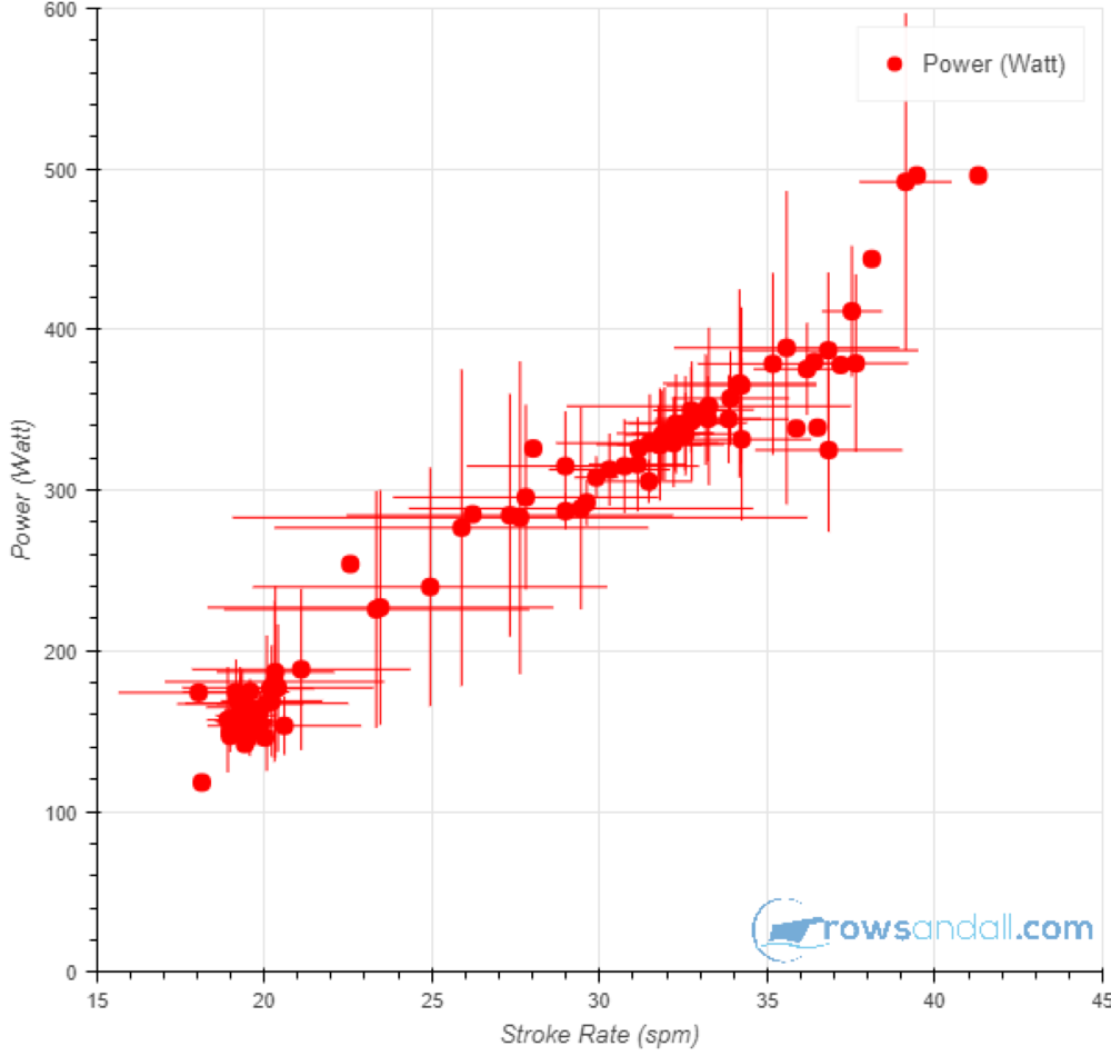
Here is an example of the Trend Flex chart:

So on the x axis we have stroke rate and on the y axis we have power. Each dot is positioned at the average stroke rate and power for that bin, and the value of the group by metric can be found by hovering over the data point with your mouse pointer. The error bars indicate one standard deviation and are a measure of how the data are distributed.
It is important to monitor the error bars. If you group by a metric that is completely unrelated to the other two, you will get error bars spanning the entire graph area. This is a cool feature, because it allows you to browse through your metrics and find relations and trends.

The chart above is an example of this effect. While on the first chart the trend between stroke rate and power is clear, in this one we have grouped by a more independent metric (stroke length) and because at a given stroke rate and power the stroke length msy be all over the place, you see huge whiskers. This is what one of our Power Users calls a ‘spider chart’.

Here is a close up of one of my recent workouts in the Trend Flex chart. I am trying to look at the relation between pace and power, and I have grouped by stroke rate with a 0.5 spm bin size. So now I can look at data points where I am faster at the same power, and compare the stroke rate. I can find out that at 320W I may be faster at 32spm than at 30spm. This is extremely useful information. The size of the error bars then also tells me that the pace distributions are overlapping by quite a lot, so the conclusion may not be as strong.
Here is another cool Trend Flex chart:

I made this one on the most recent version of the site, which adds a descriptive title to the chart. So you can read that I plotted Slip vs Average Drive Force and I have grouped the data over stroke rate. As expected, slip is pretty strongly correlated with stroke rate as well as average drive force.
It is interesting to also make the reverse chart:

As you can see, this chart is really one that helps you explore your rowing. This is not a routine chart that you make for every outing, but you have to sit down, play with the data and think about what they mean. Sometimes the trends will be obvious. Sometimes you will see a confirmation of what your video analysis tells you. And sometimes you will stumble upon a surprising relationship. “That is odd,” you will say, and that is the moment when you are really learning something about your rowing.
Of course, coaches using the Team module can make the Trend Flex for each of their team members. Finally, this chart is available and useful both for erg workouts and on the water rowing.
Watch this space and follow us on twitter, because we will improve the Trend Flex fast to make it as useful as possible!